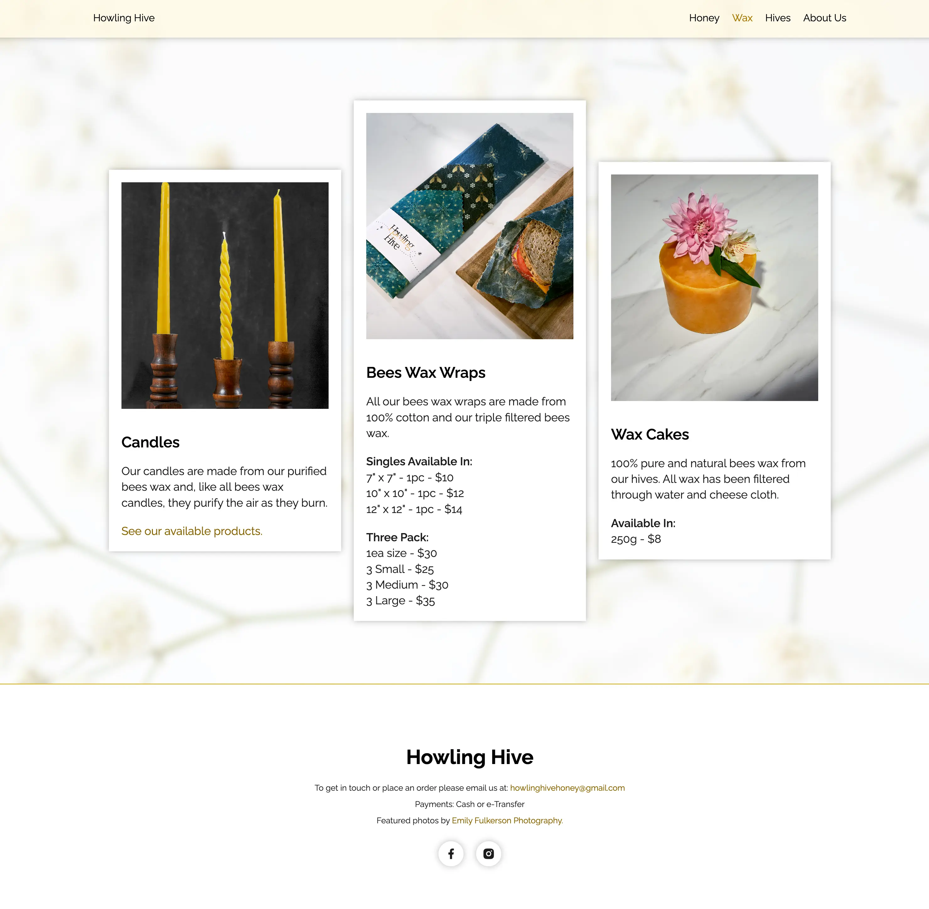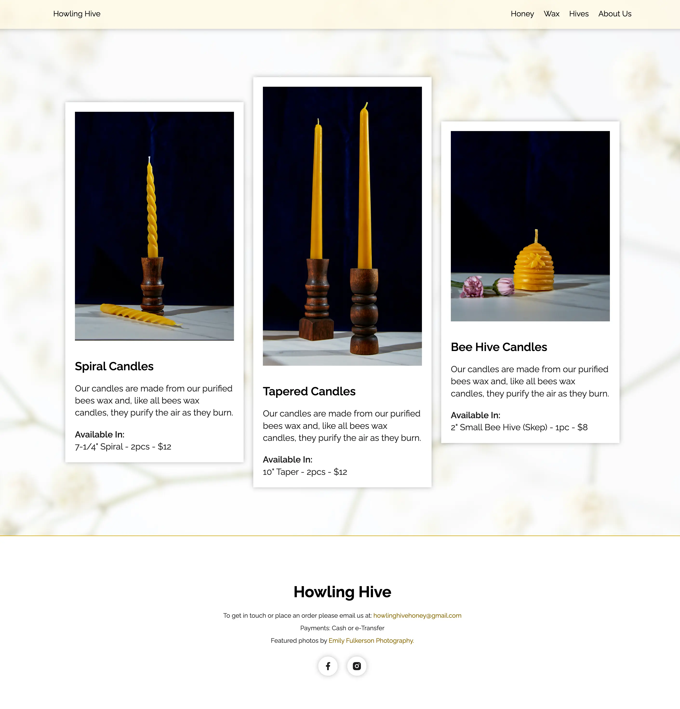
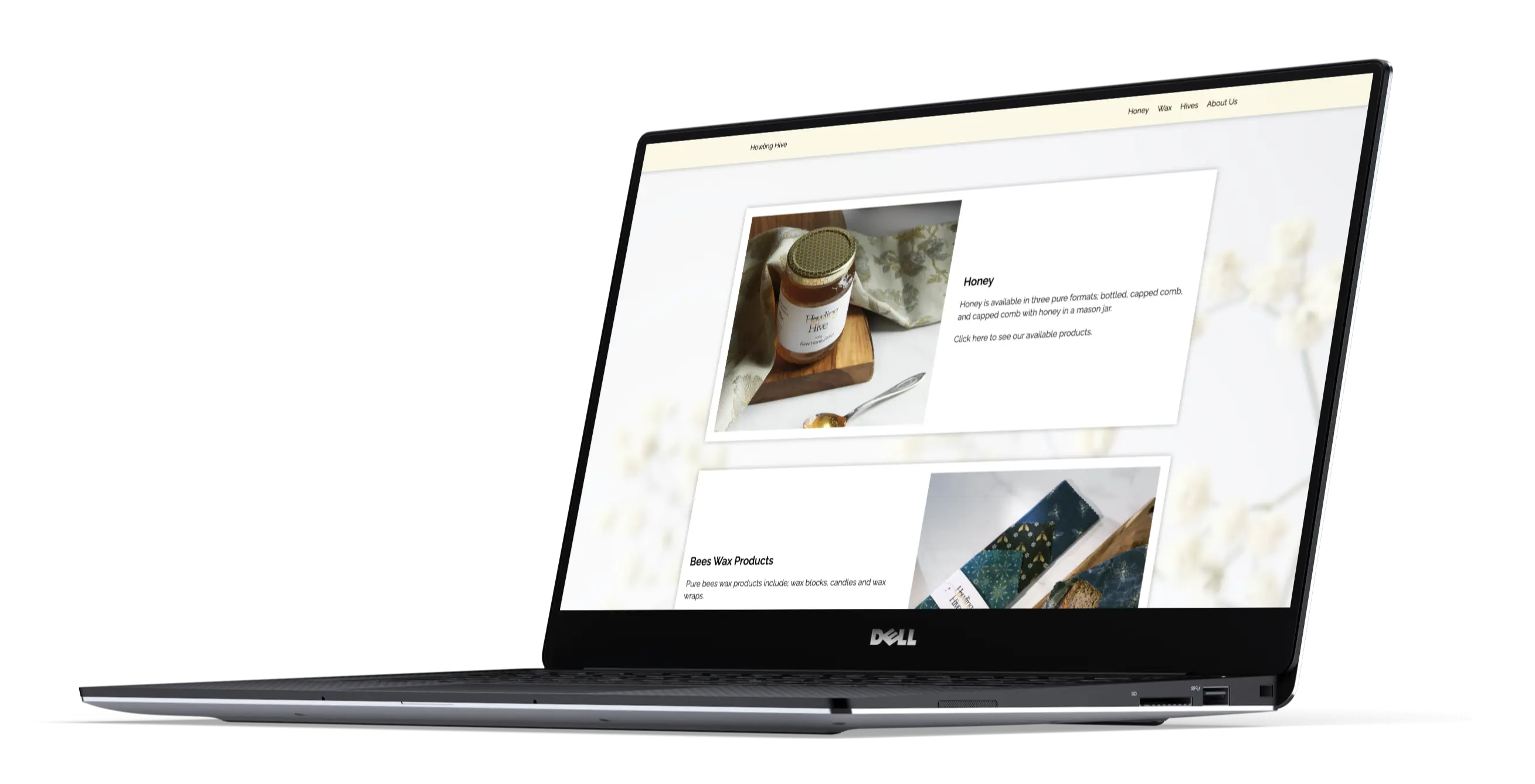
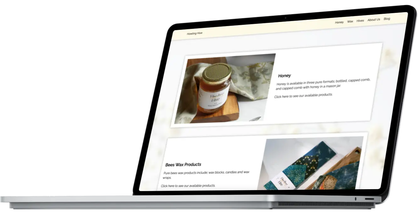
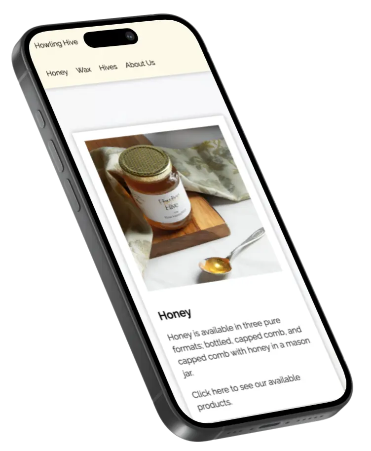
Sticky Navigation
In creating useful navigation for the website, I opted for a sticky header. This would allow users constant access to the header navigation, making browsing products easier and faster.
4 minute read
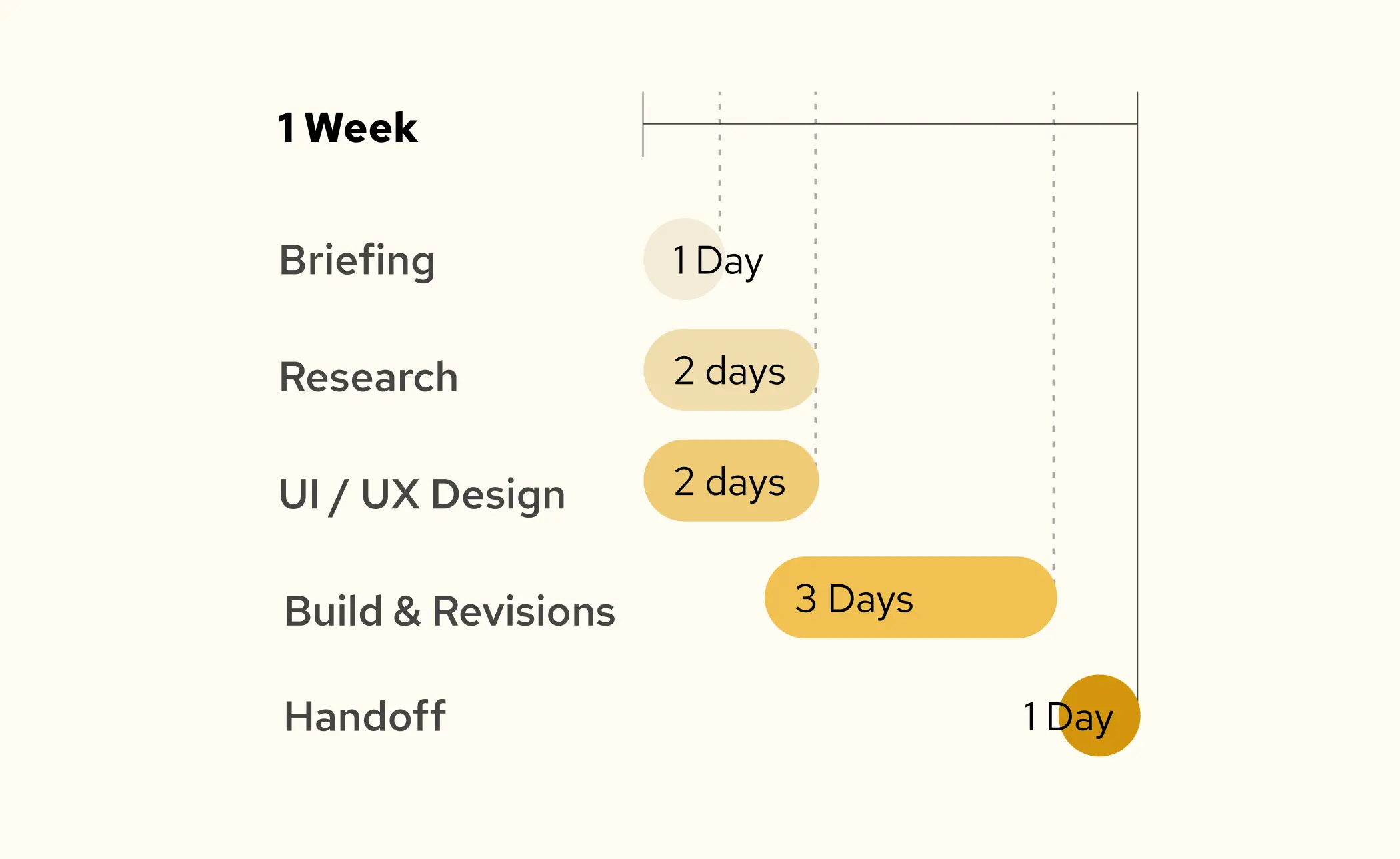
When Howling Hive's web host shut down, they needed a quick site migration to keep their small business online. We used the opportunity to redesign their site in one week - focusing on major UX pain points to create a frictionless user experience and a cohesive, refreshed visual design.
Howling Hive | 2024
Design | UI/UX | Branding
Designer & UX Developer
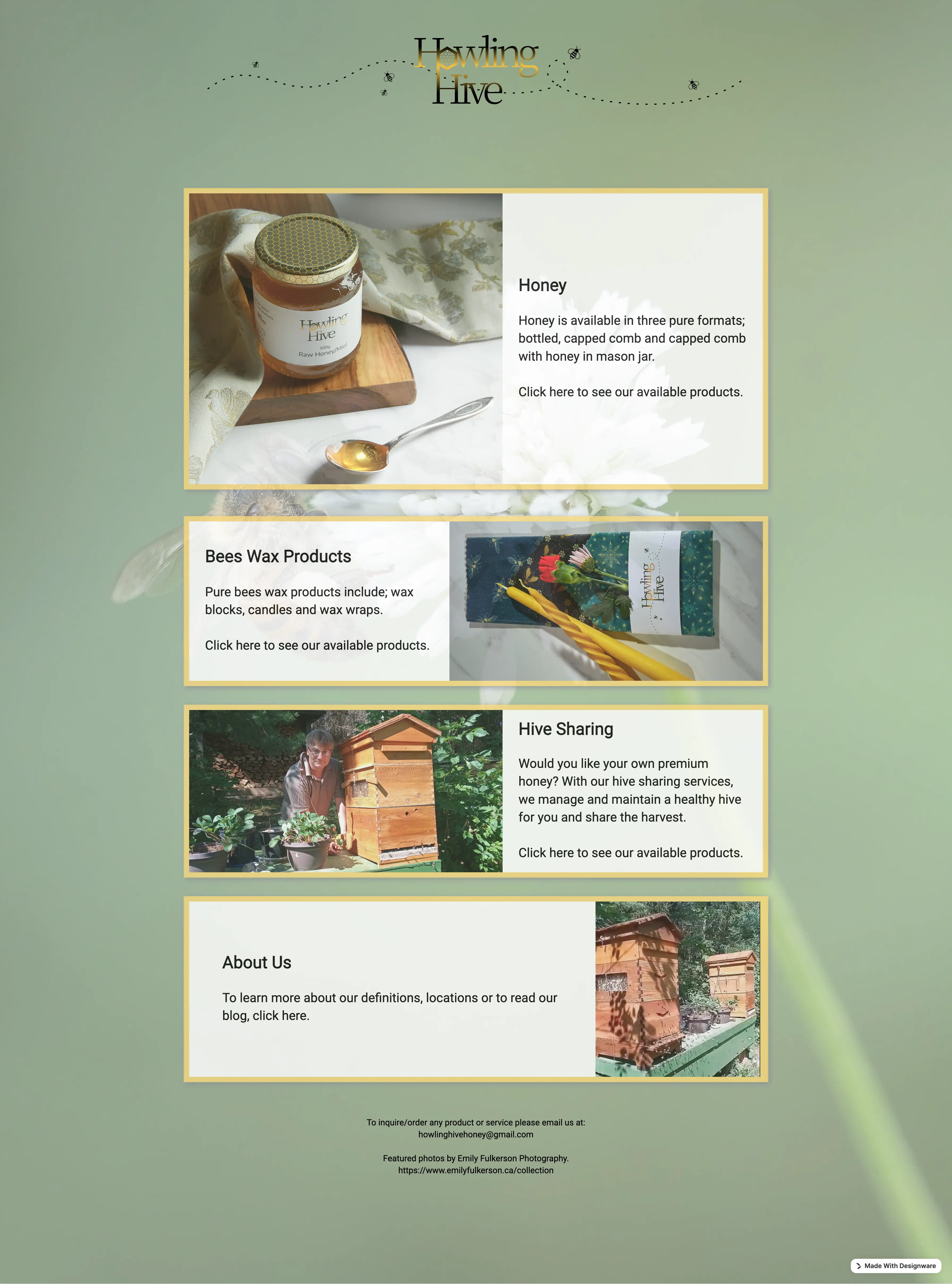
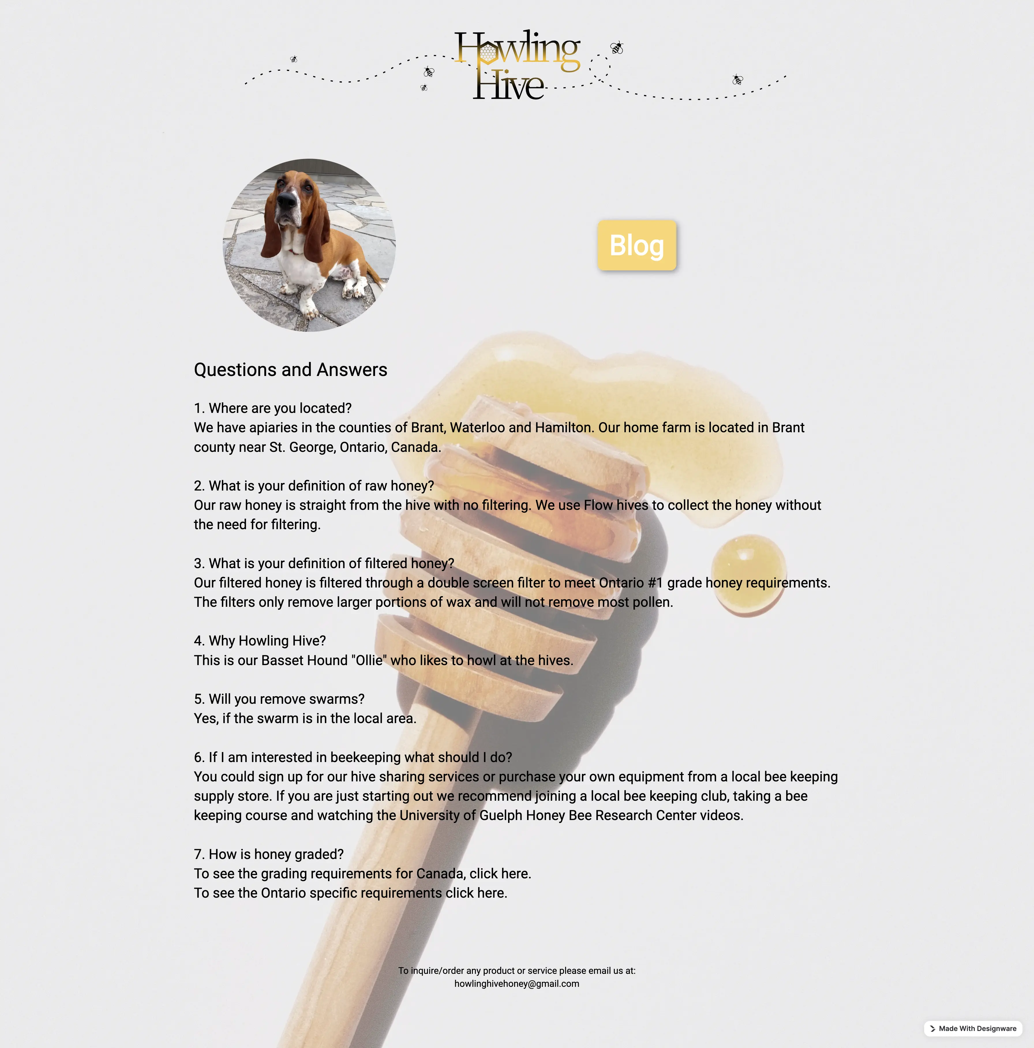
Howling Hive had a big problem for a small business. Their web services provider was shutting down, and they couldn't afford a large disruption to their online presence. The initial website had been built by the business owner using a template builder and no longer suited the needs of the business.
I was given one week to redesign the website to avoid any service disruptions. The owner was looking to correct a few major paint points in the user experience and update the visuals for a more polished and professional feeling.
The client had indicated there were a few issues with the site's navigation, or lack thereof. Their customers had reported issues with moving between pages and finding specific products. During my assessment of the website, I found a few prominent pain points:
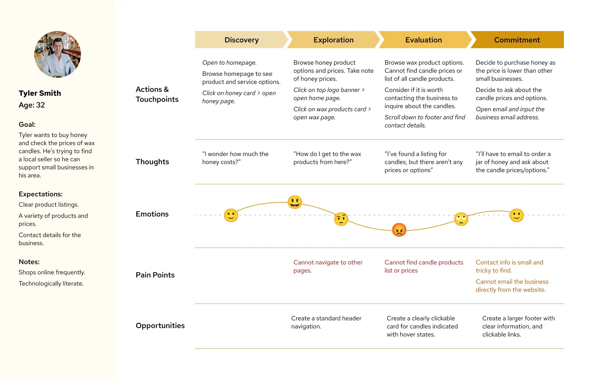
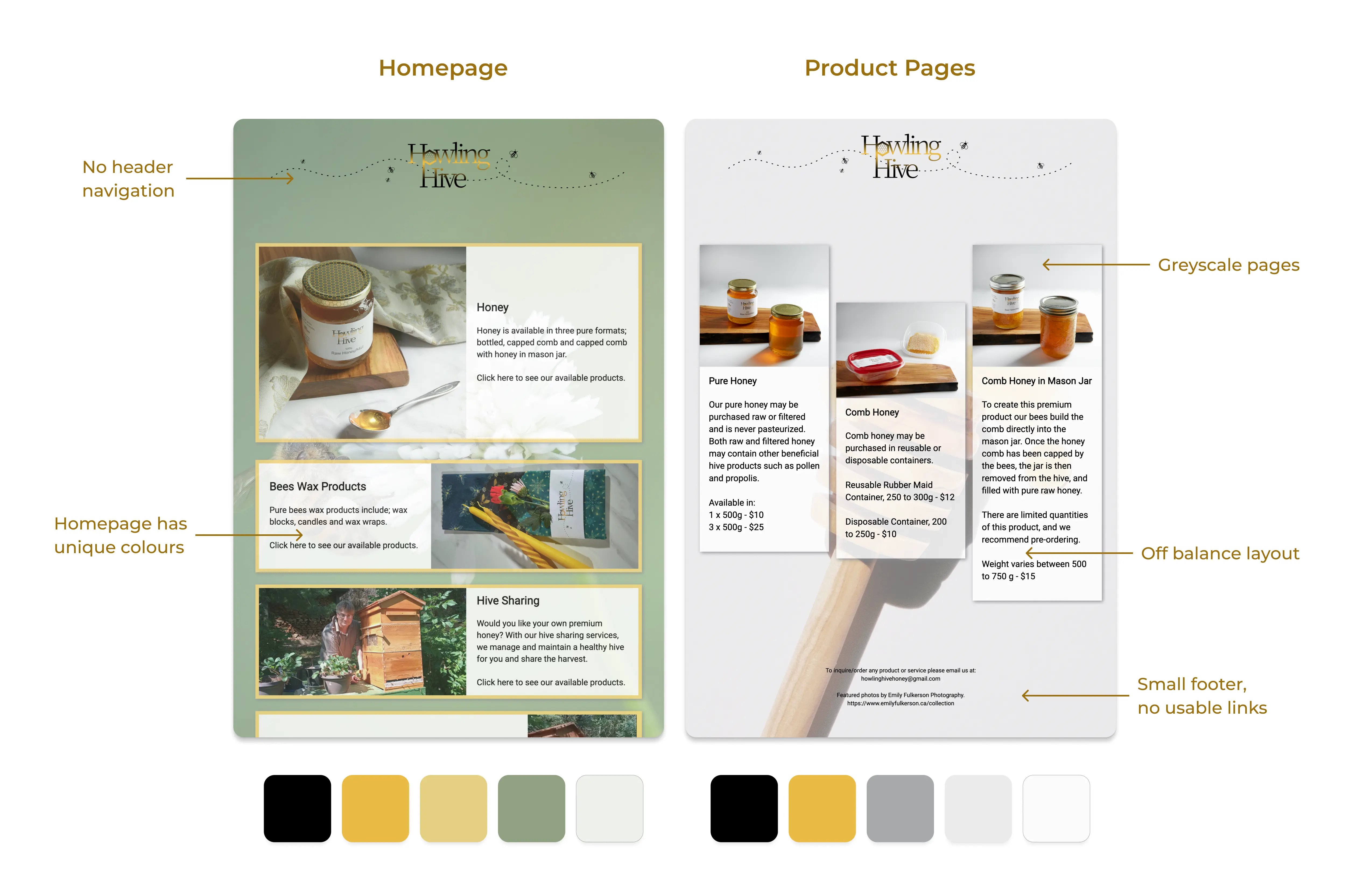
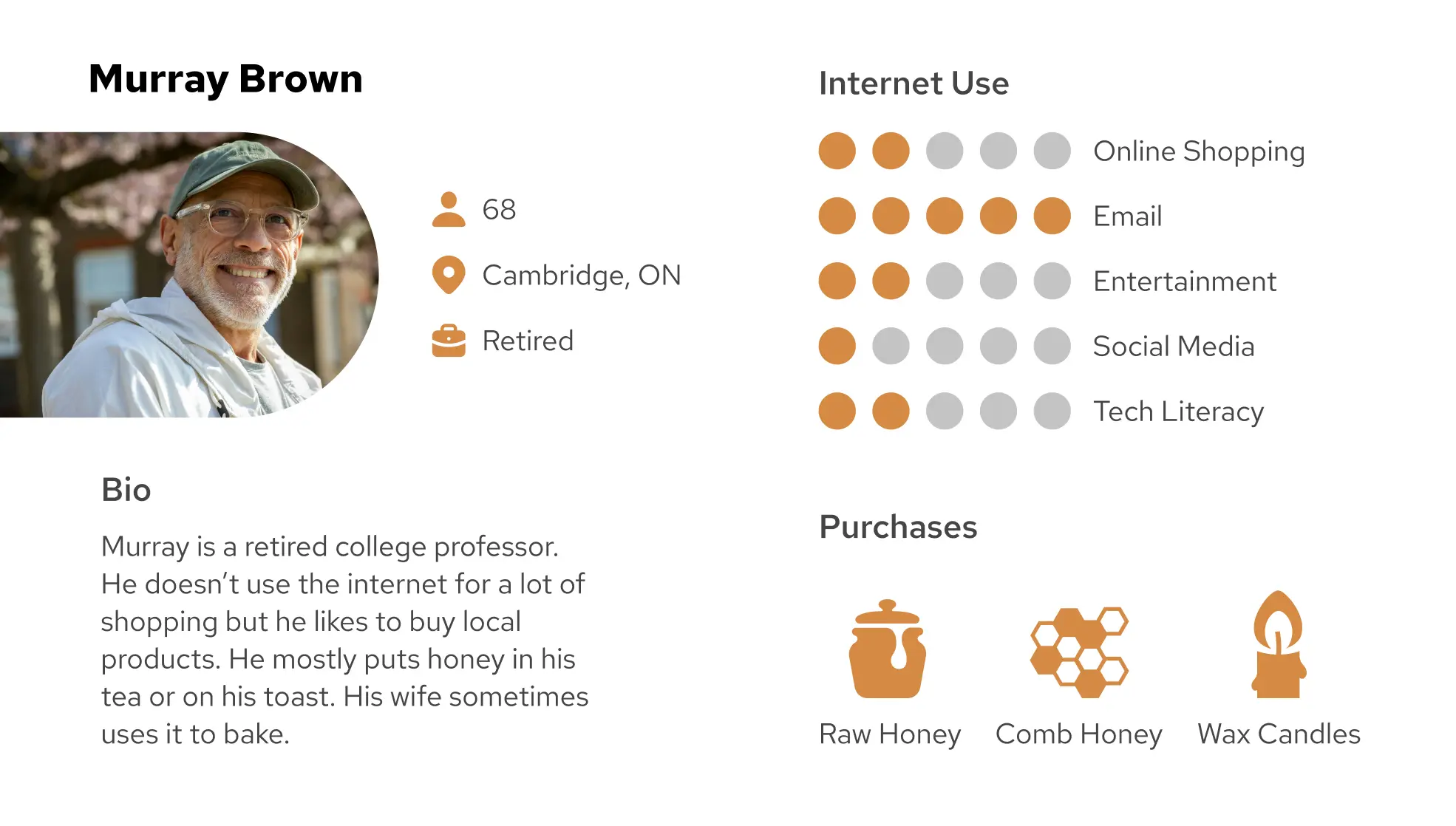
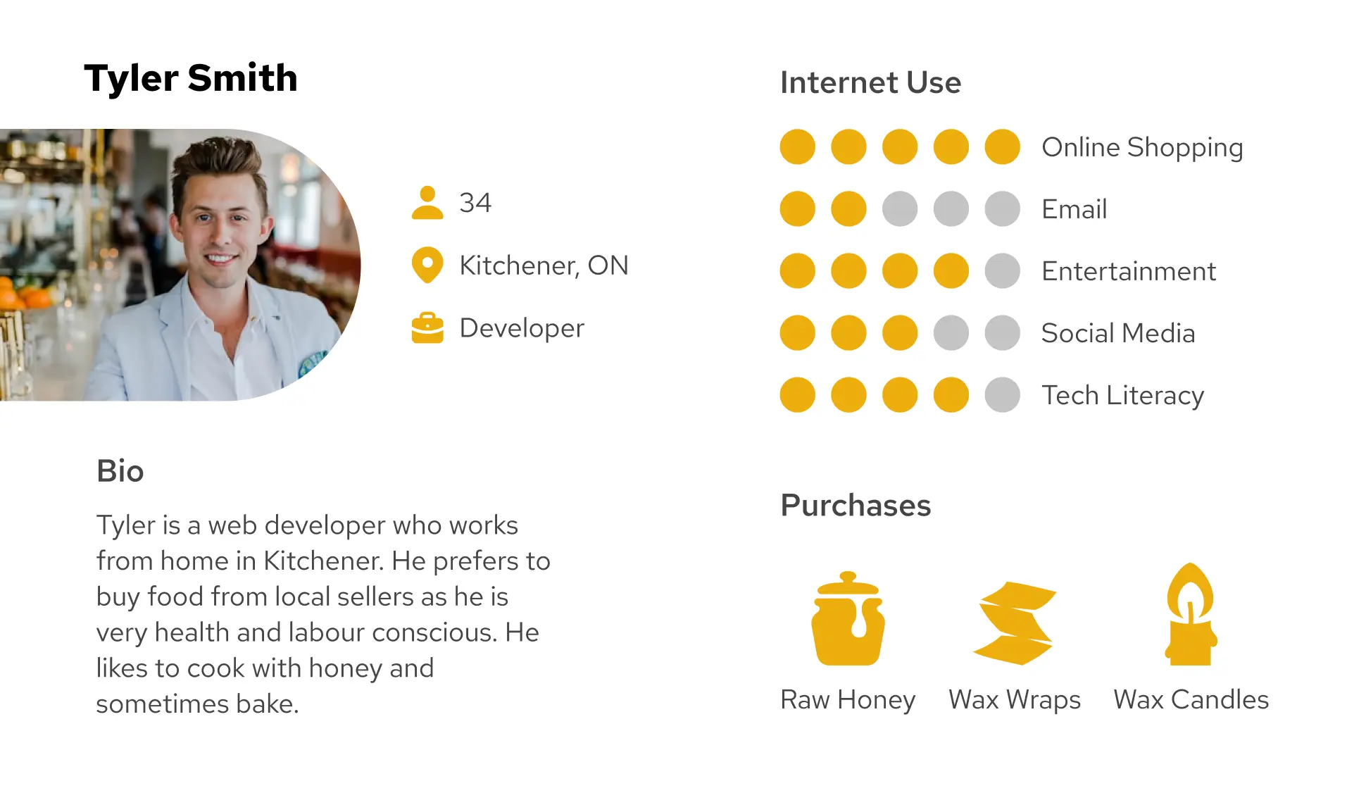
In creating the initial site, the owner had assumed a customer base of 50+ and had designed the site accordingly, with oversized text and little navigation. But with the business now up and running, it was clear that their clientele skewed closer to 30. This new persona became central to the website's redesign, allowing me to update the UI for a younger, more technologically literate audience.
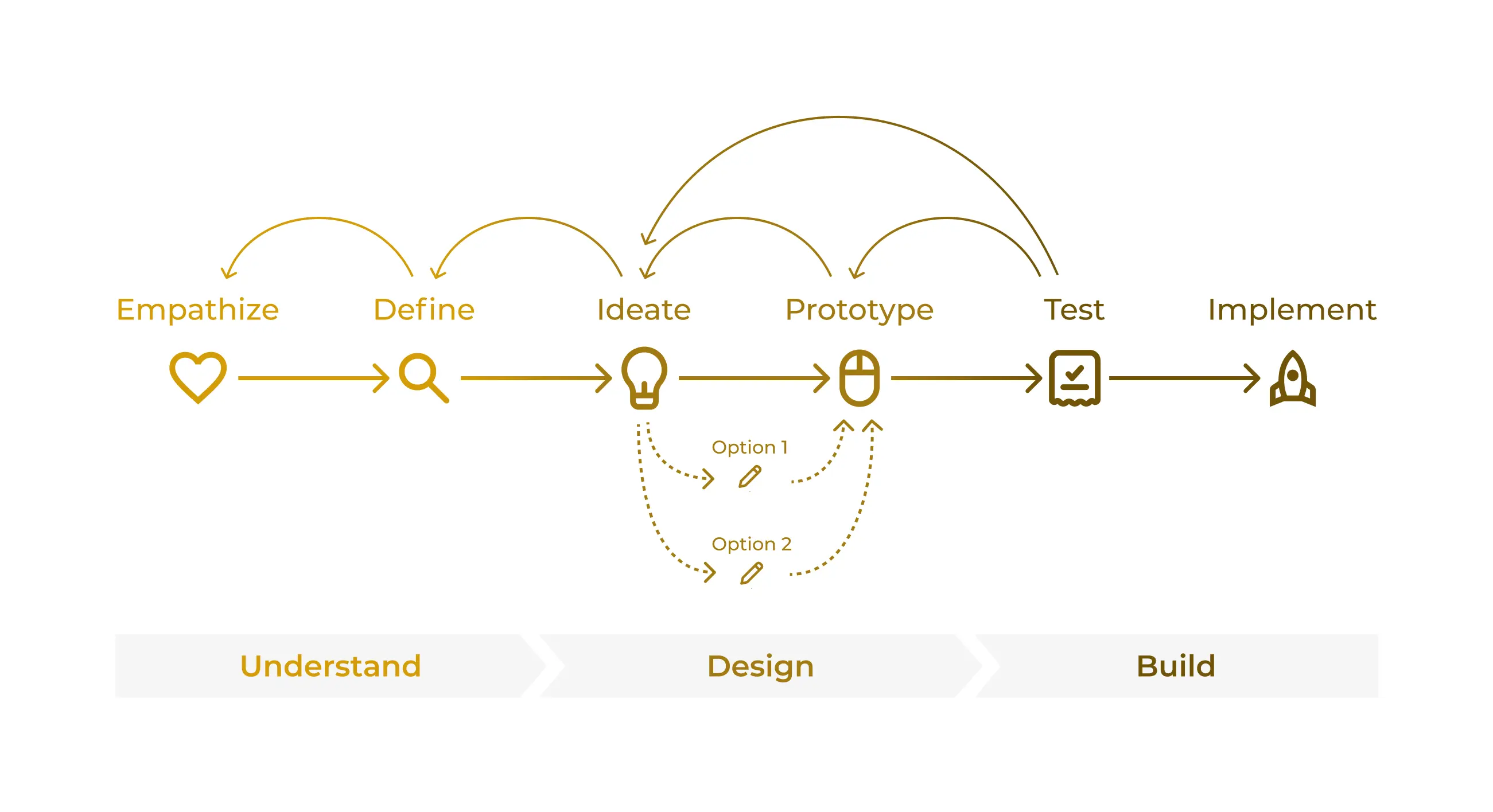
In one week, I would not have time to overhaul the entire site. I needed to prioritize updates based on their impact on the user's experience.
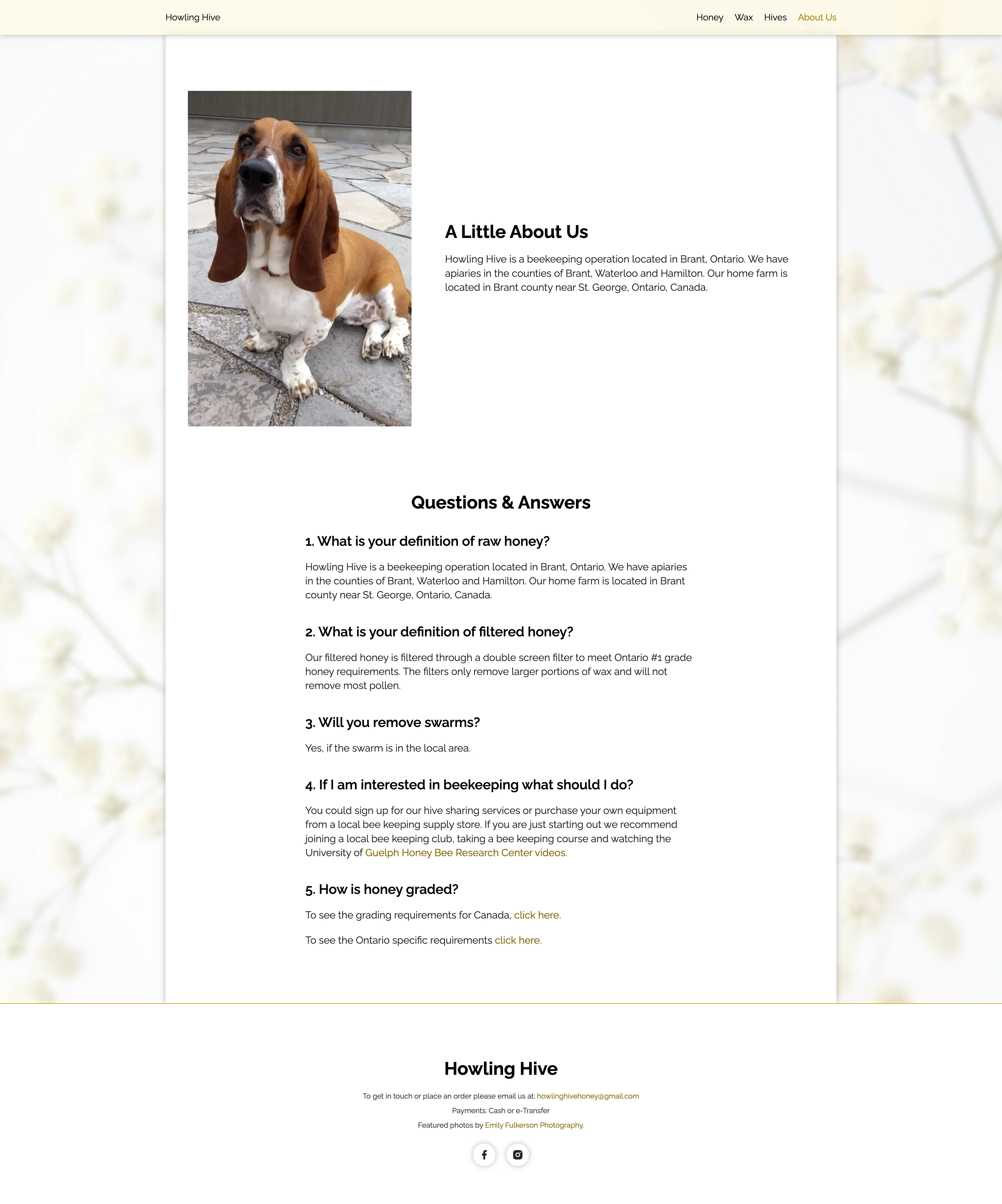
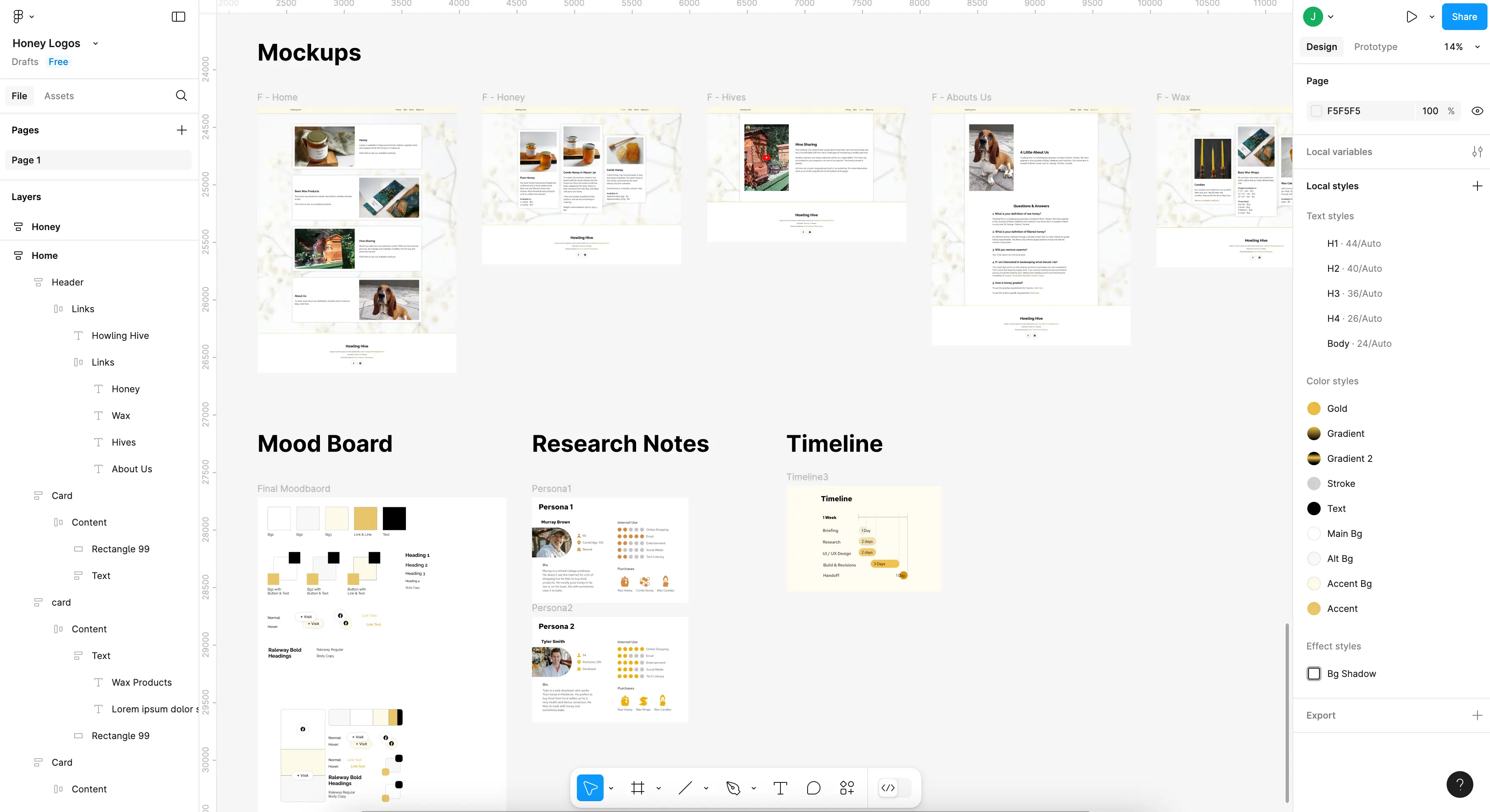
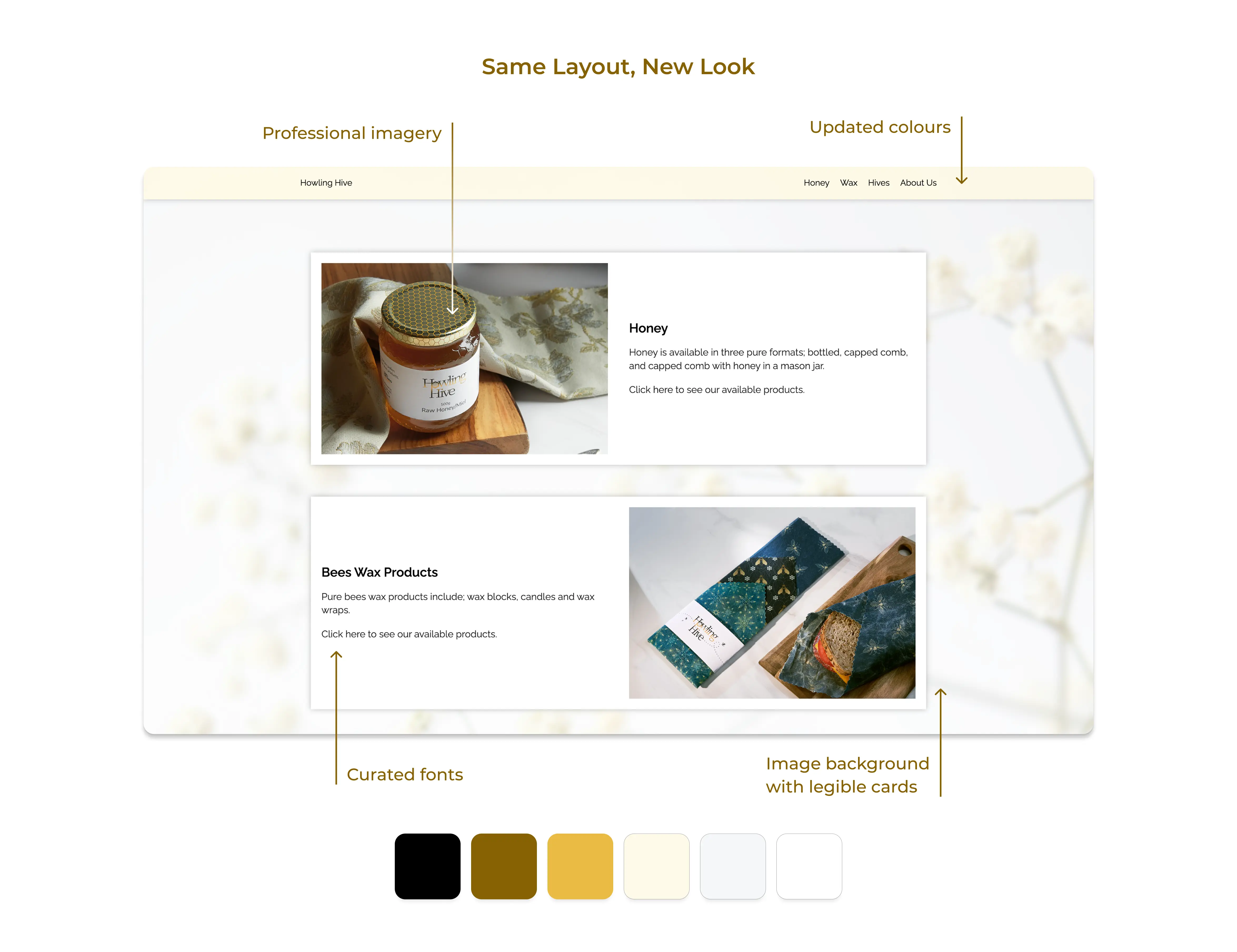
Instead of completely redesigning every page of the site, I opted to give it a facelift. Leaving the page layouts mostly intact, I updated the website's branding. With a new colour scheme, font choice, and professional imagery, the pages felt transformed. Allowing me to focus my limited time on the larger issues with the user interface.
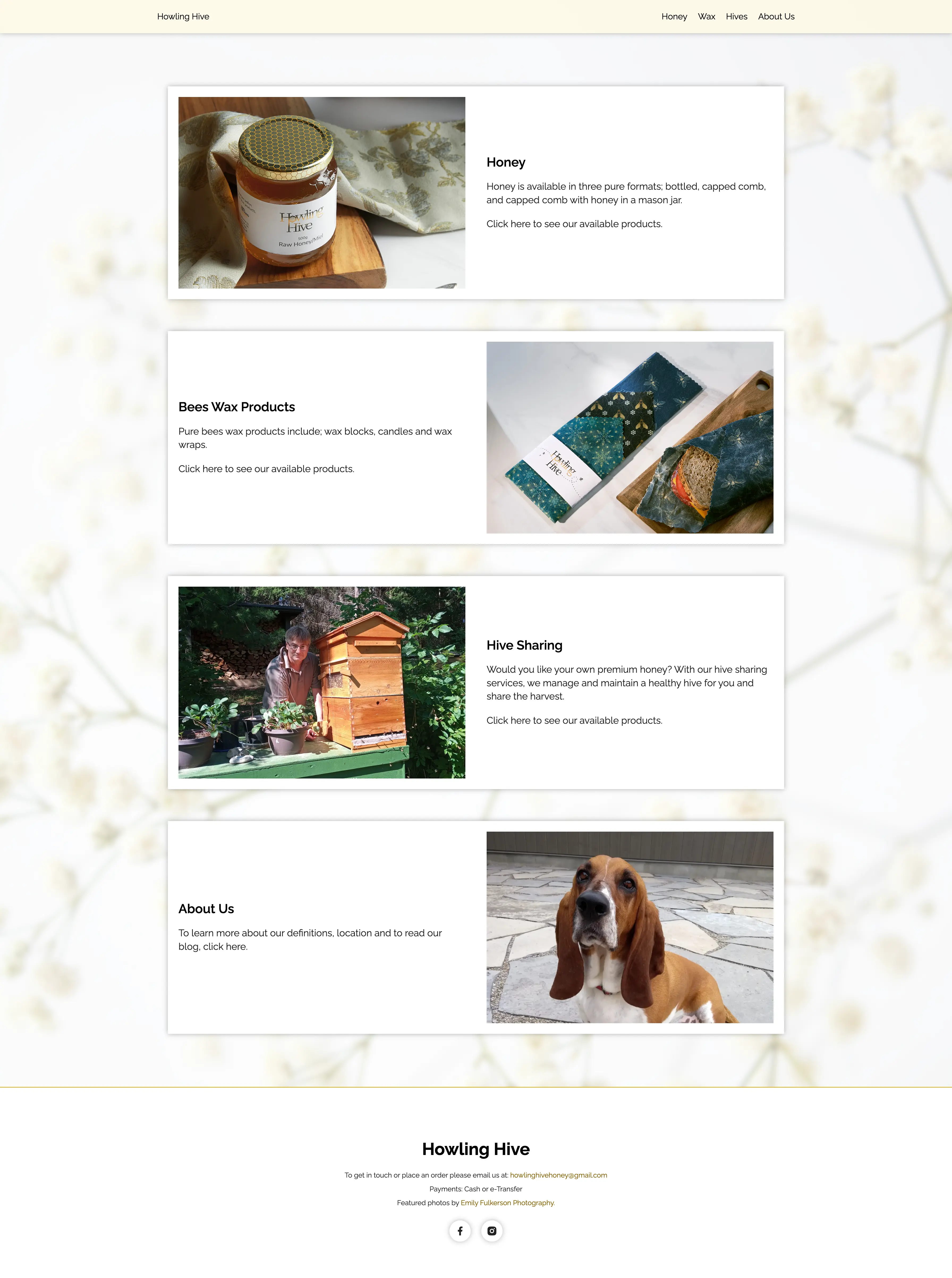
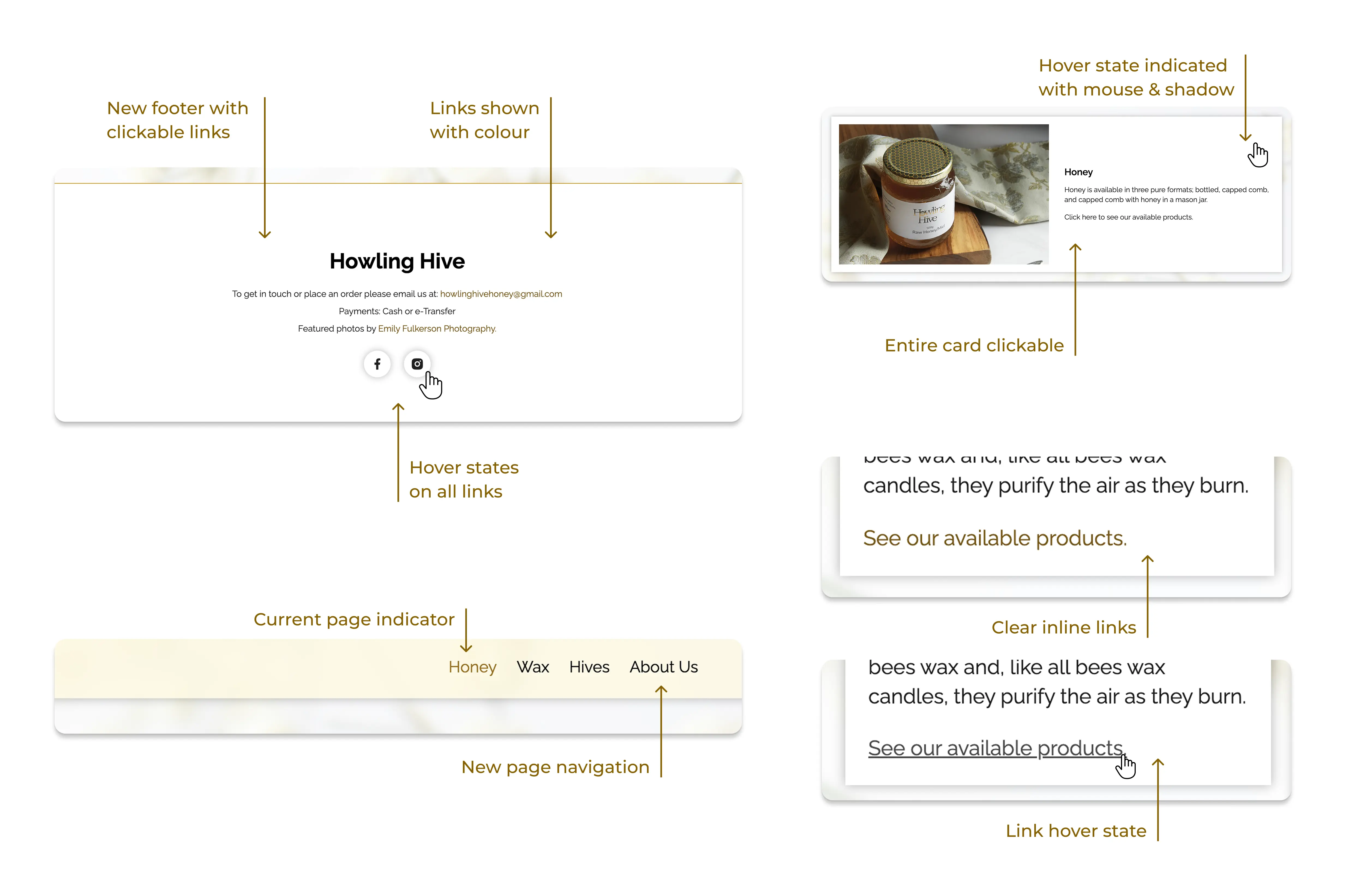
Though the user interface issues caused the most difficulty, the fix was quite simple. I added a standard header and footer for easy navigation between pages, or to the brand's social media. Now users could navigate to any page on the website without first having to return to the homepage.
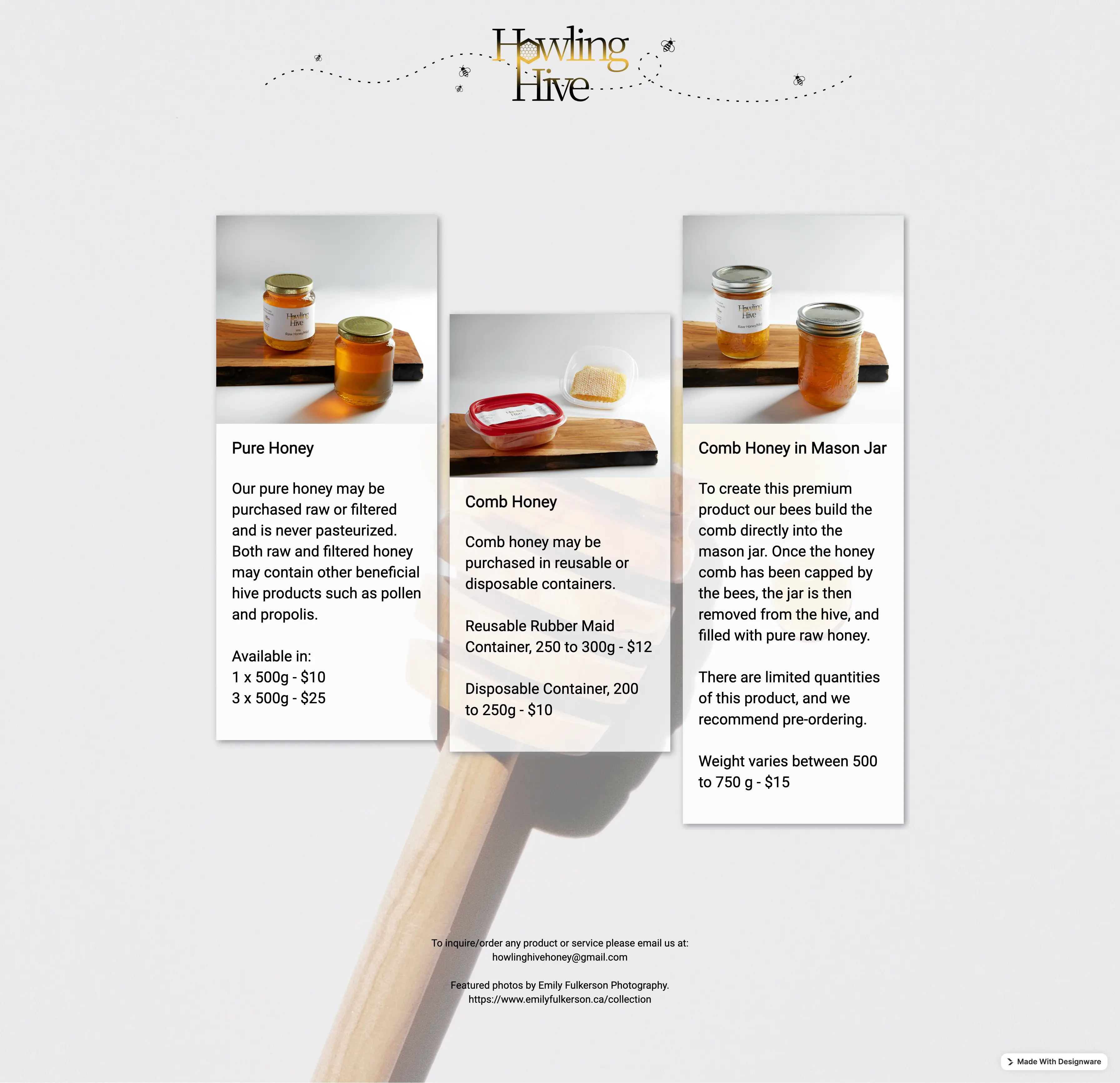
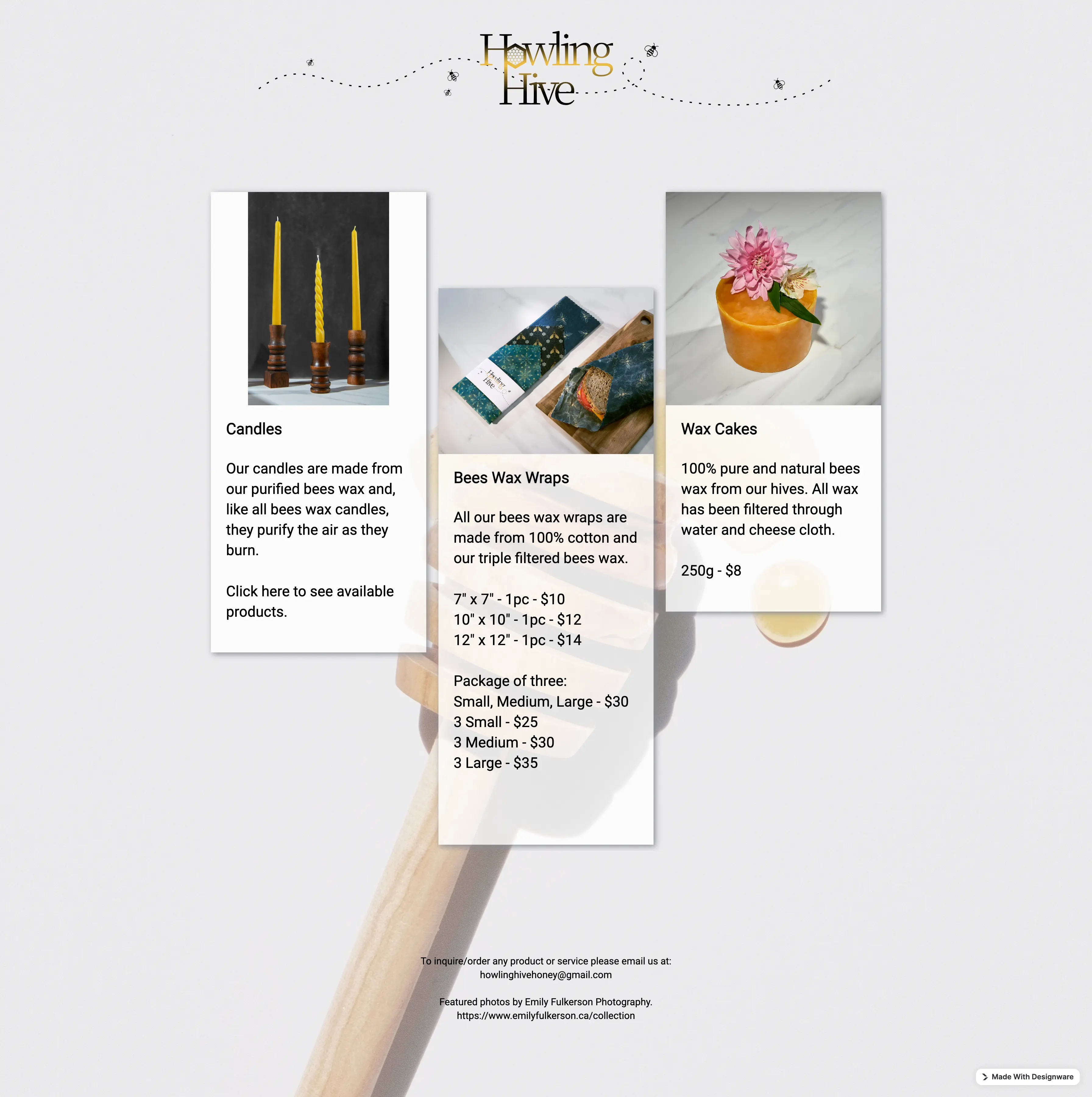
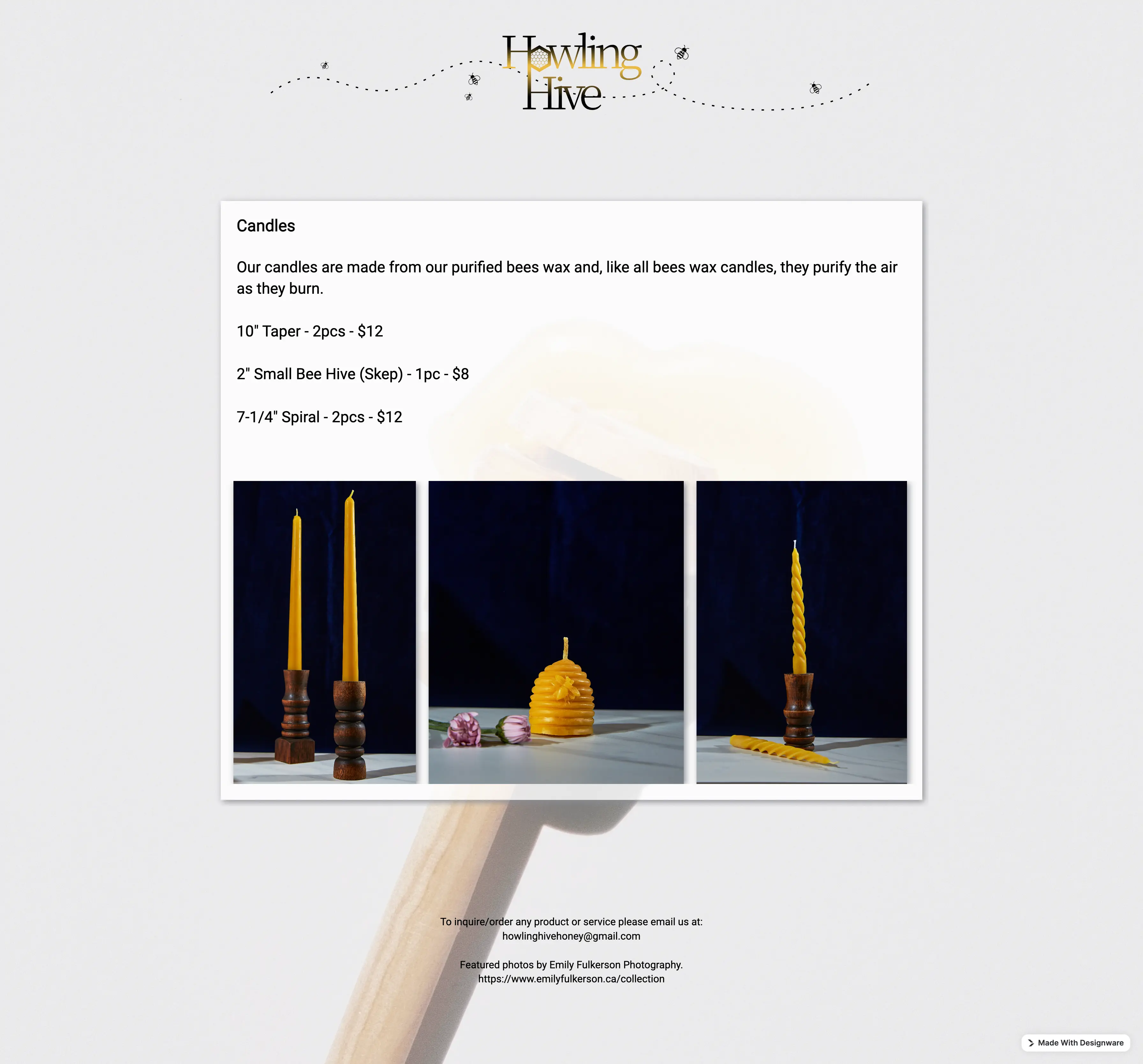
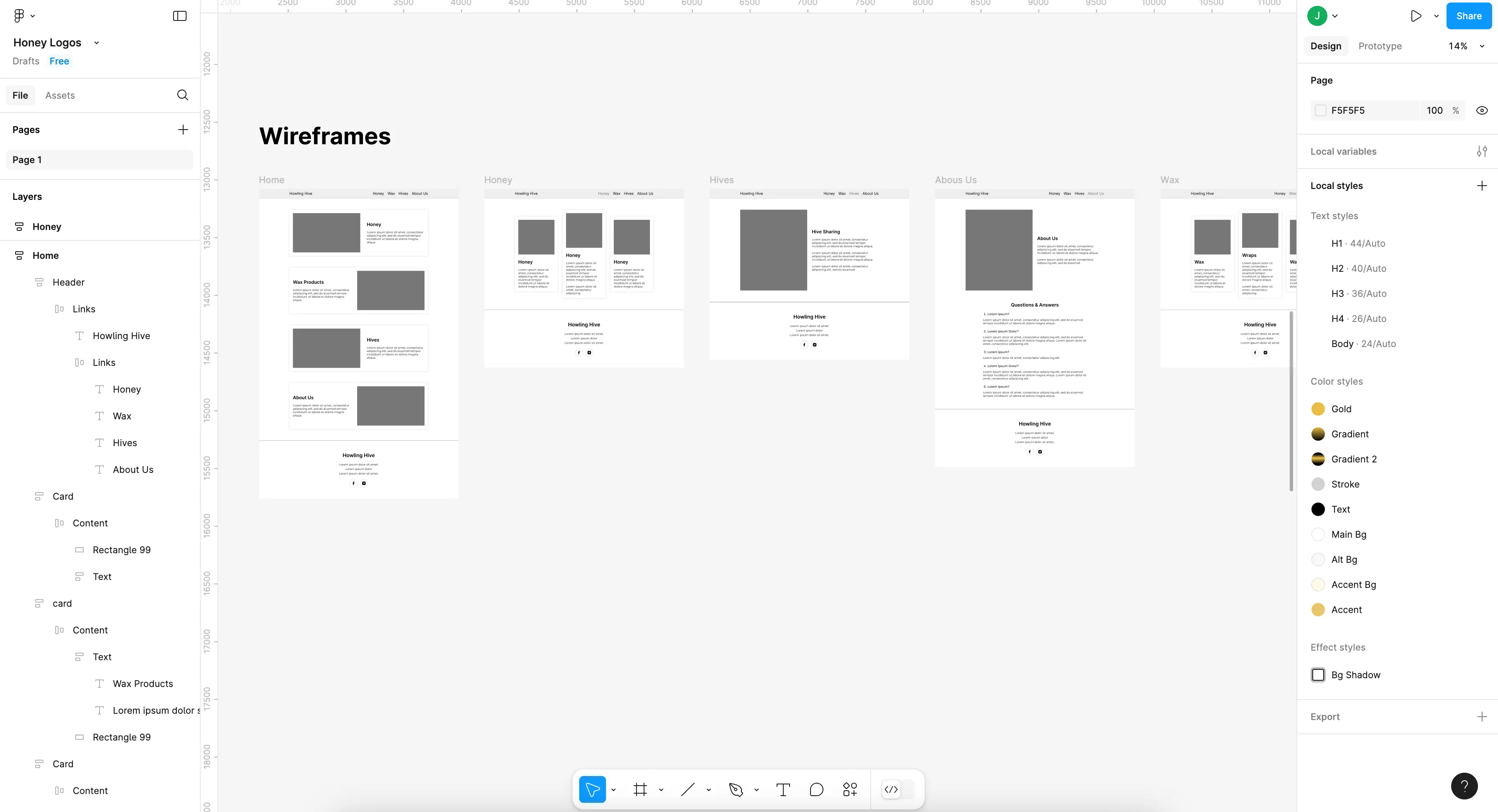
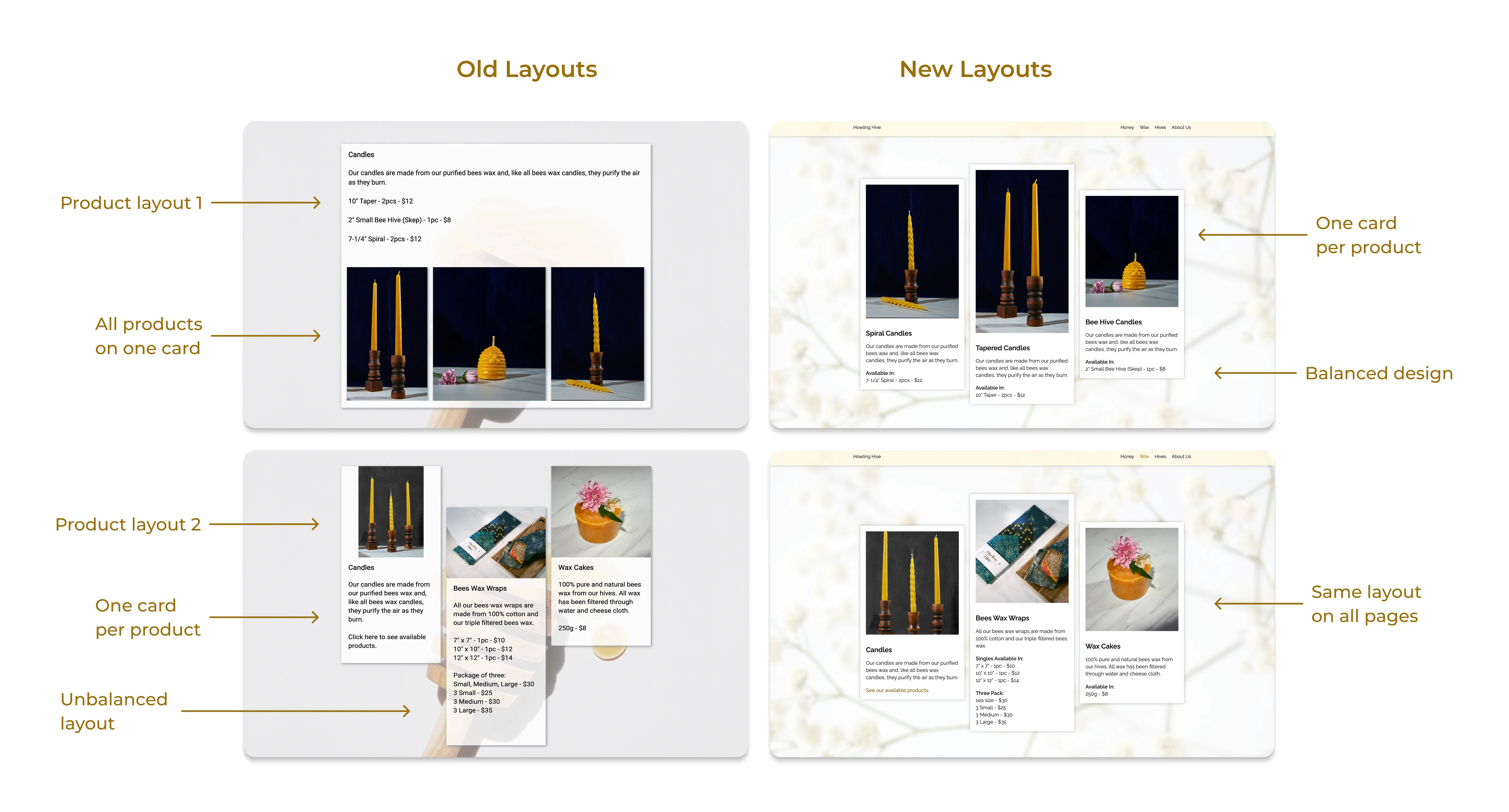
Another small but impactful change was the alignment of the product page layouts. Previously, products were displayed in two ways: one product per card, or all products on one card. This increased the user's mental load, forcing them to read all information to find product prices, instead of skimming.
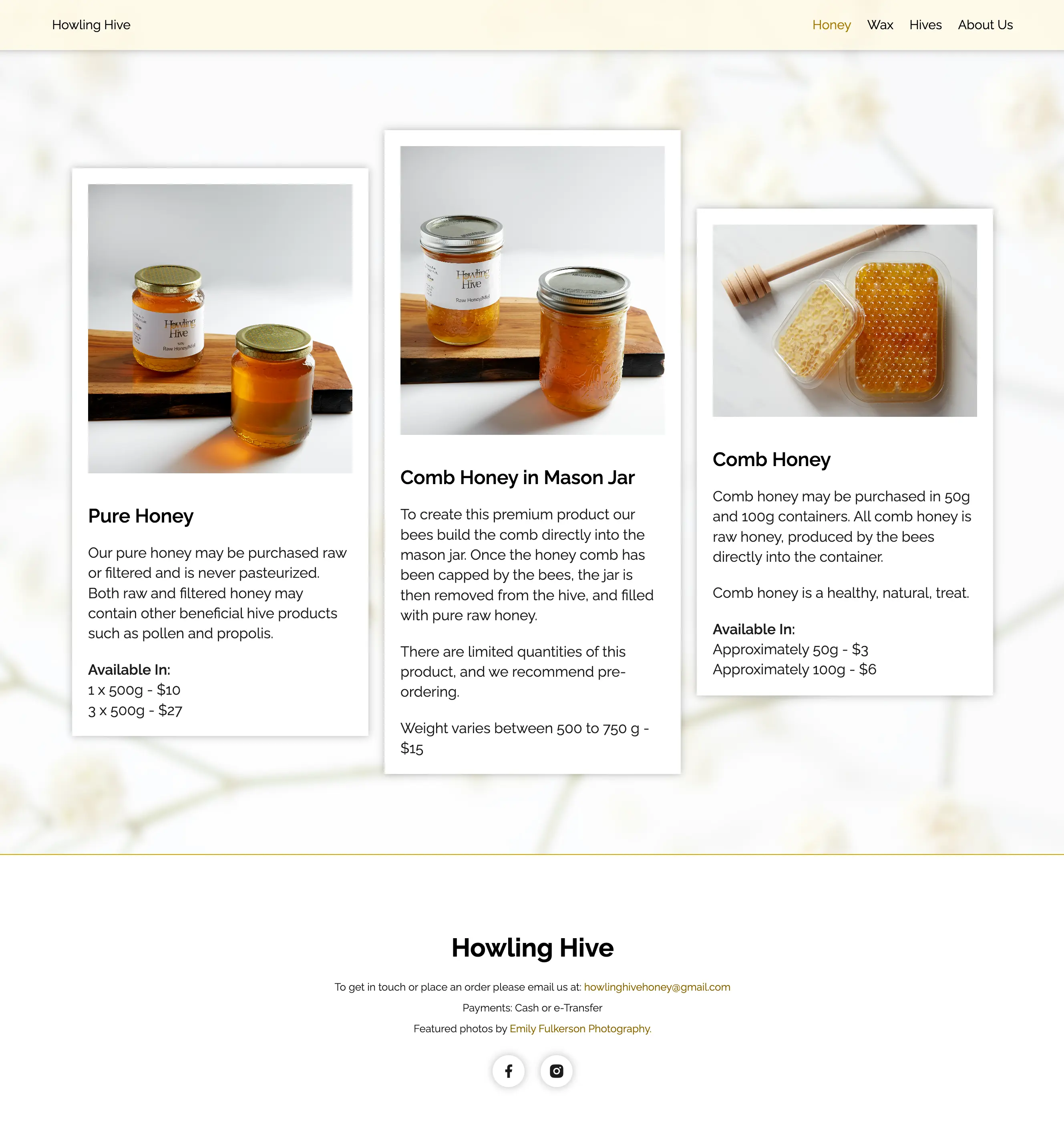
With all product pages now following a standardized layout, users could quickly scan page contents to identify a product and its price.
By focusing on major pain points over minor flaws, I was able to deliver maximum impact with my updates in just one week. The new website catered to a younger clientele with these key updates:
In creating useful navigation for the website, I opted for a sticky header. This would allow users constant access to the header navigation, making browsing products easier and faster.
As requested by the client, an image background was used on the new website to add graphic depth. I decided on a simple floral image in combination with a solid white background to keep all text legible.
By using colours already present in the brand's product design, I was able to unify the website's formerly disjointed colour scheme. This created a clean, modern design with brand consistency.