Prioritizing Information
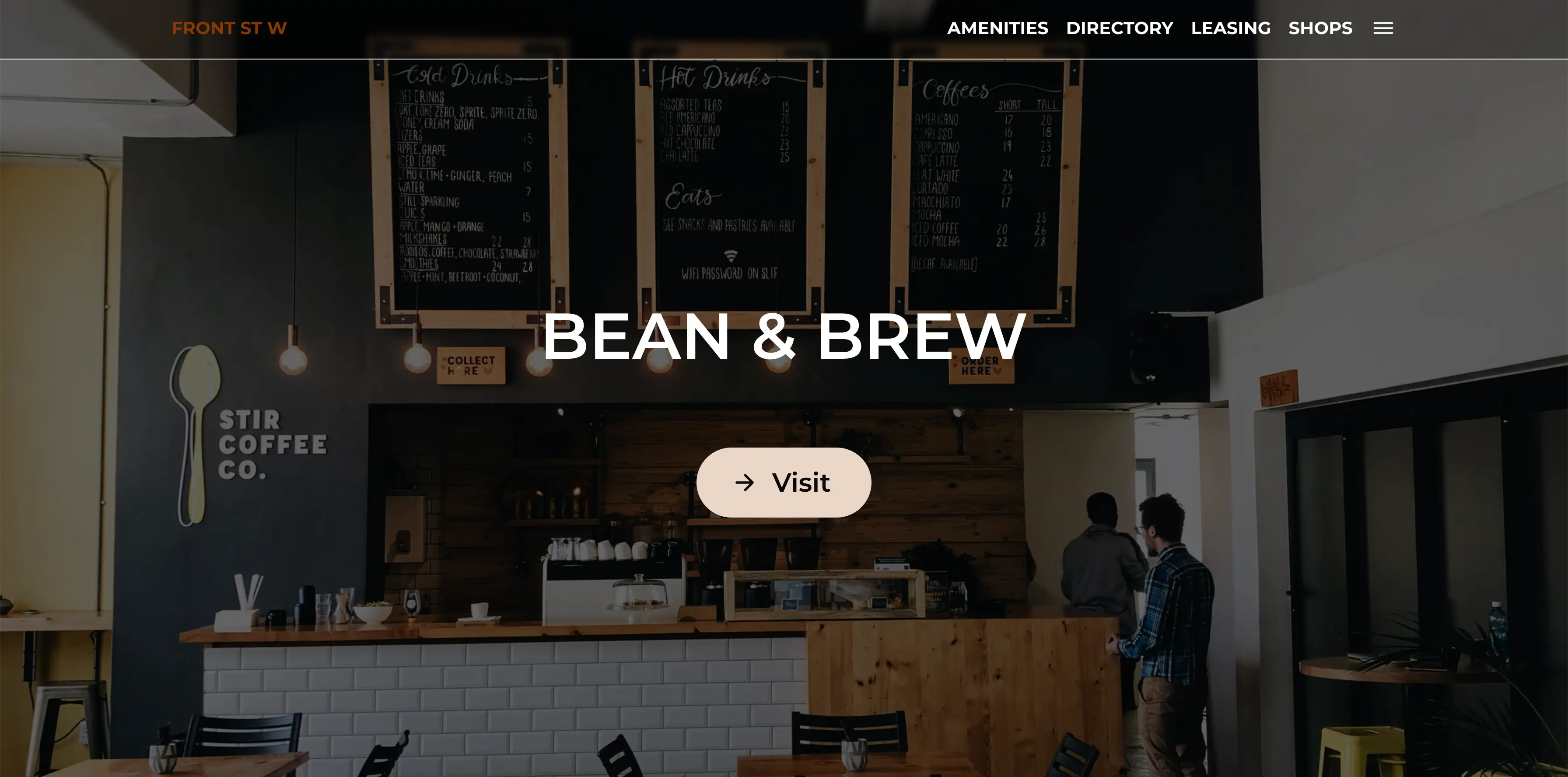
By creating an updatable CMS, we made certain the website could plug and play any property location by simply filling out an online form to repopulate the content.
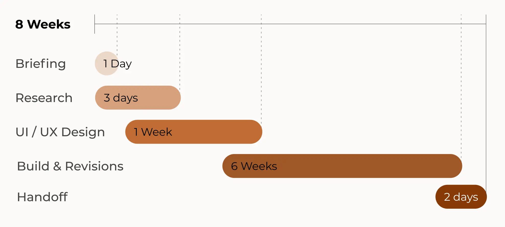
4 minute read
Creating a data-driven website to showcase PremiseHQ’s commercial and industrial properties in one beautiful package came with many challenges. By drawing inspiration from luxury hotels and high-end custom homes, I was able to create a distinctive design that presents all available property data in bite-sized, user-friendly pieces.
PremiseHQ | 2023
Research | UI/UX | Data
Designer & UX Developer
This work was built with the help of AI to increase the speed of completion and integrate frontend functionality from the Figma design into the completed webpage.
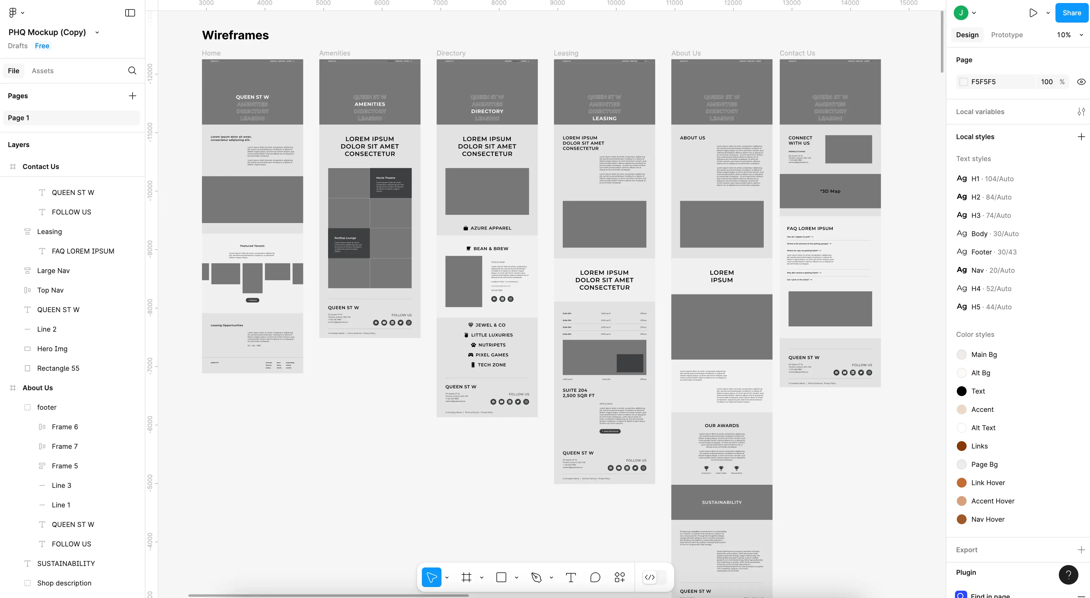
Helping users to see the forest for the trees is no small feat when creating designs for data driven websites. As a SaaS company focused on data management across commercial and industrial properties, PremiseHQ was looking for an attractive way to showcase property data to clients.
PremiseHQ was very specific about needing a bold design to catch customers' attention. I was advised that this project would be a statement piece not just for the client but for Designware as well, something to hook our future clients with. It was also my first big solo assignment at Designware - no pressure!
There were two major issues to address with the website:
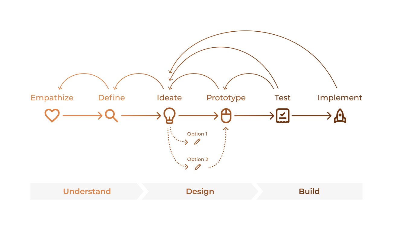
To create a showcase-worthy solution for both the client and my employer, I began by researching what makes a typical and atypical website for property management. Before I could design something out of the box, I had to first know what was inside it.
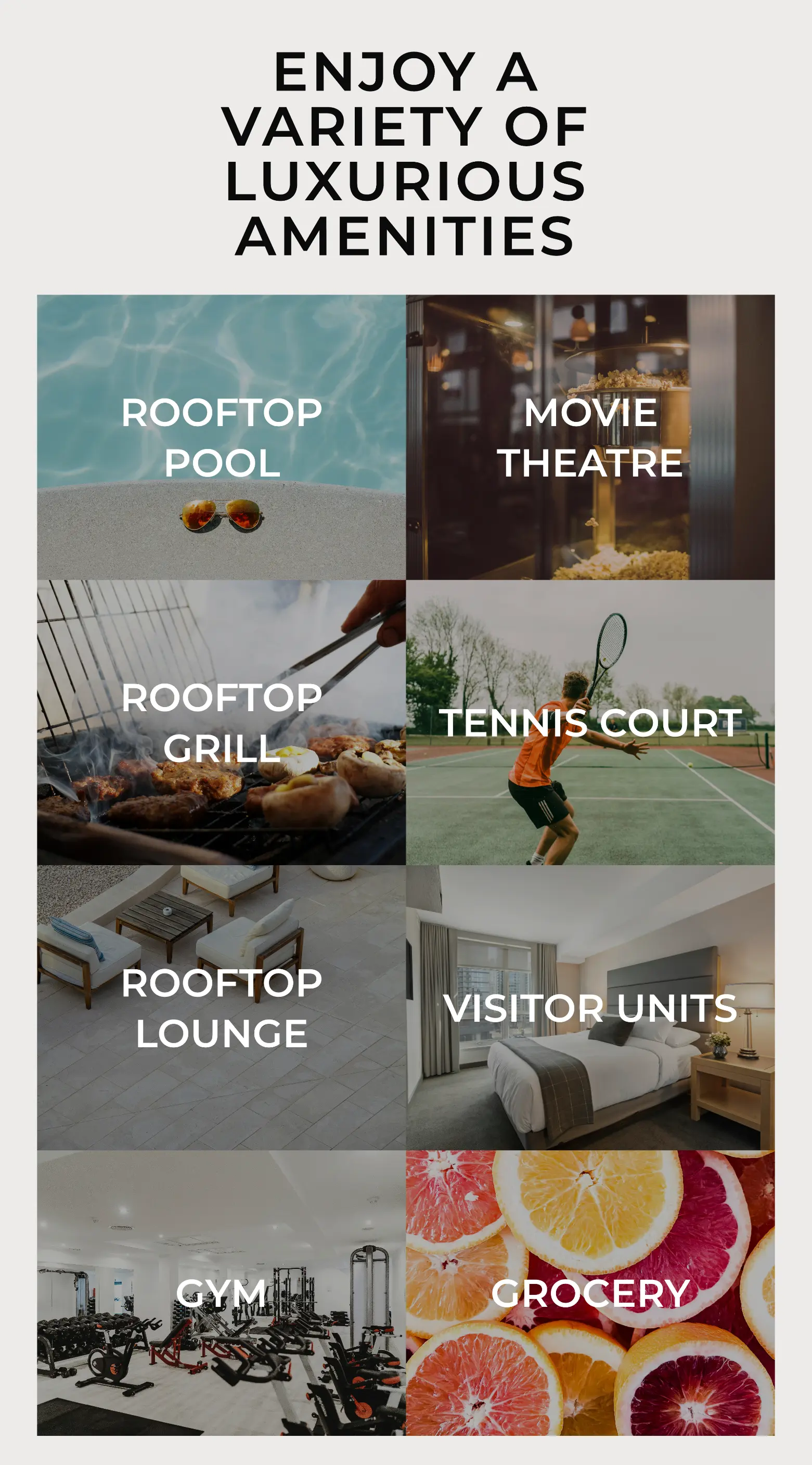
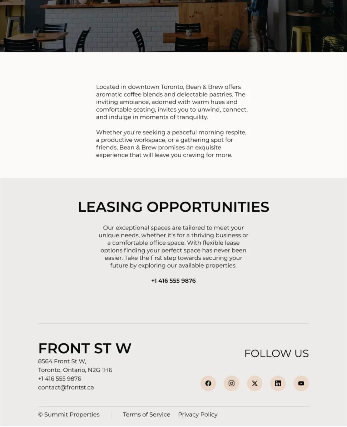
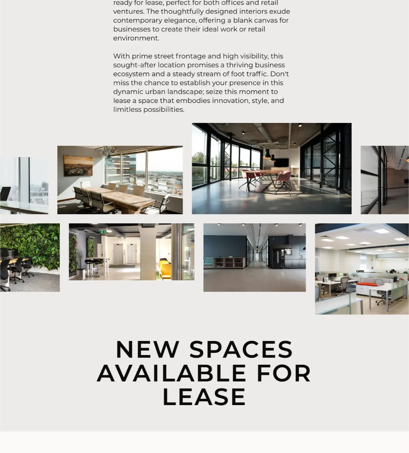
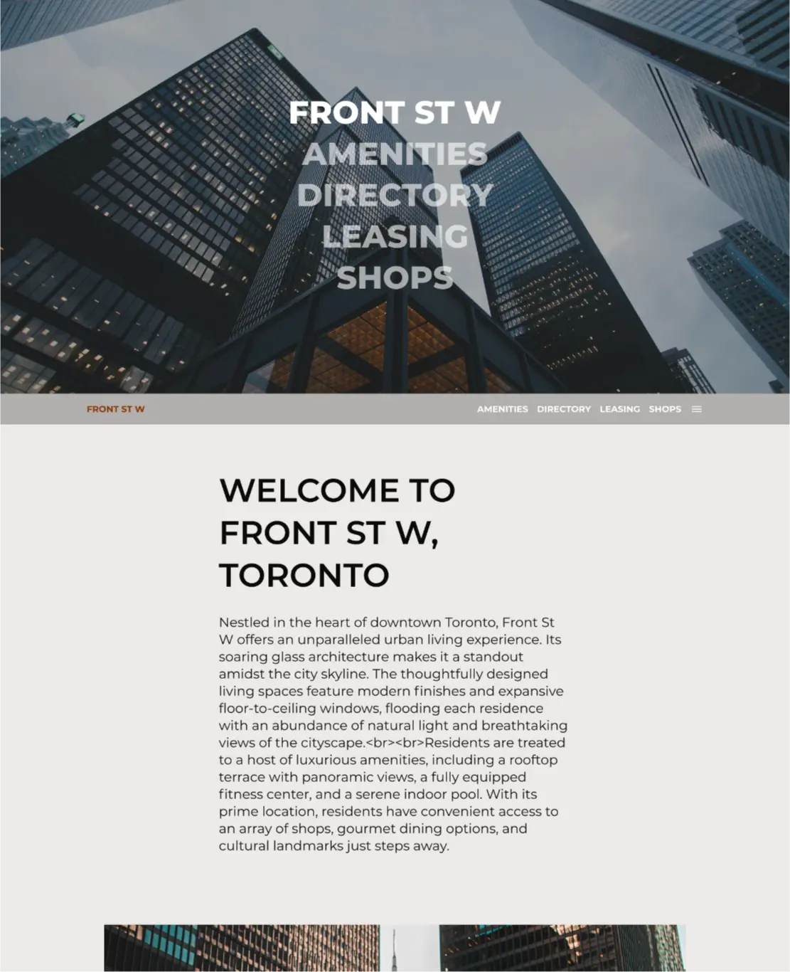
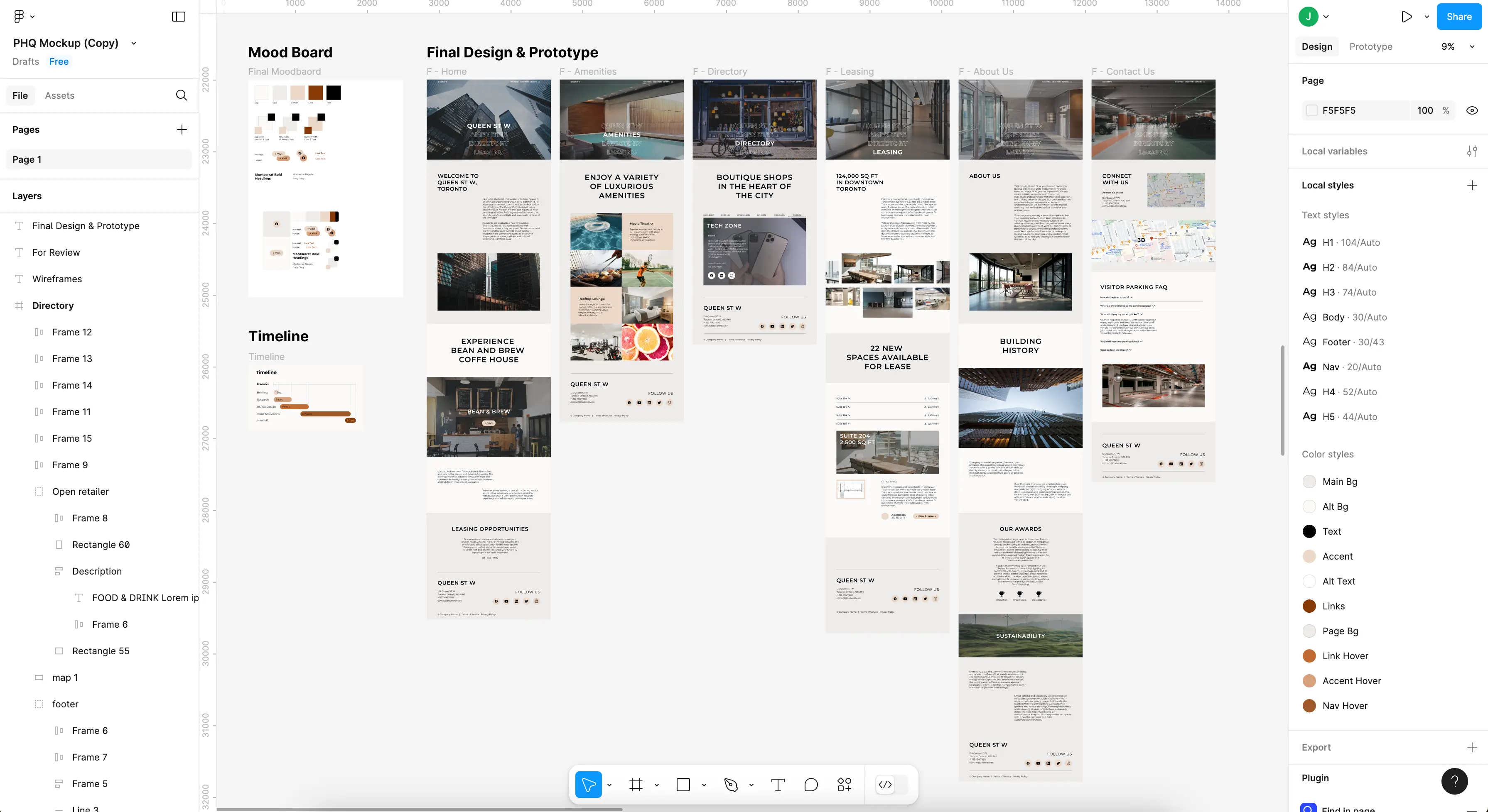
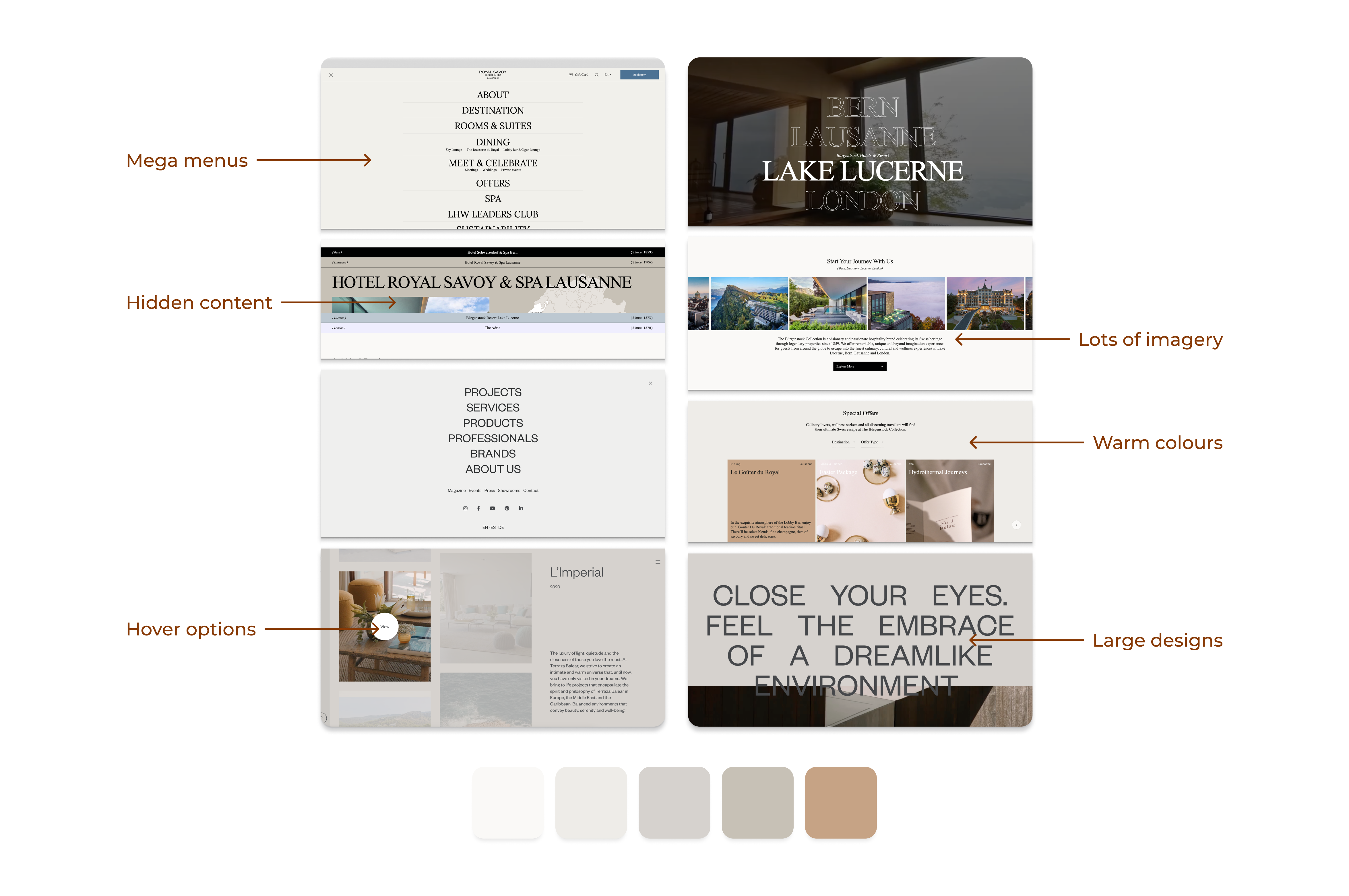
I found inspiration in the design of websites for luxury properties. From exclusive hotels to expensive custom homes, I found ways to beautifully present mountains of information without the uninspired white listings of a real estate website.
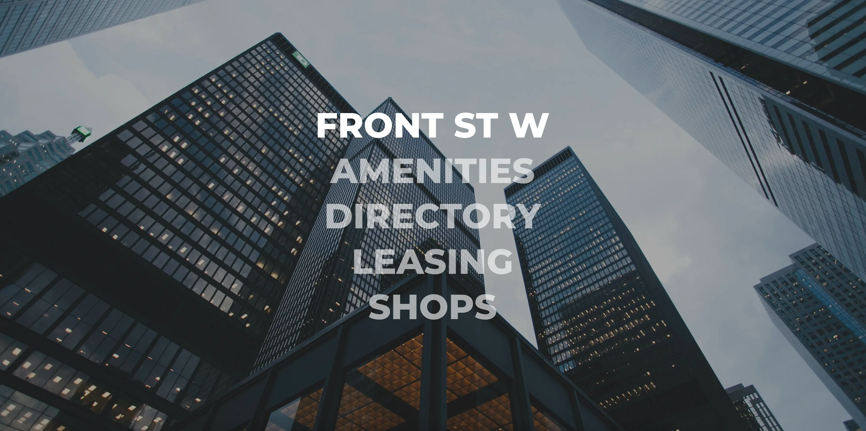
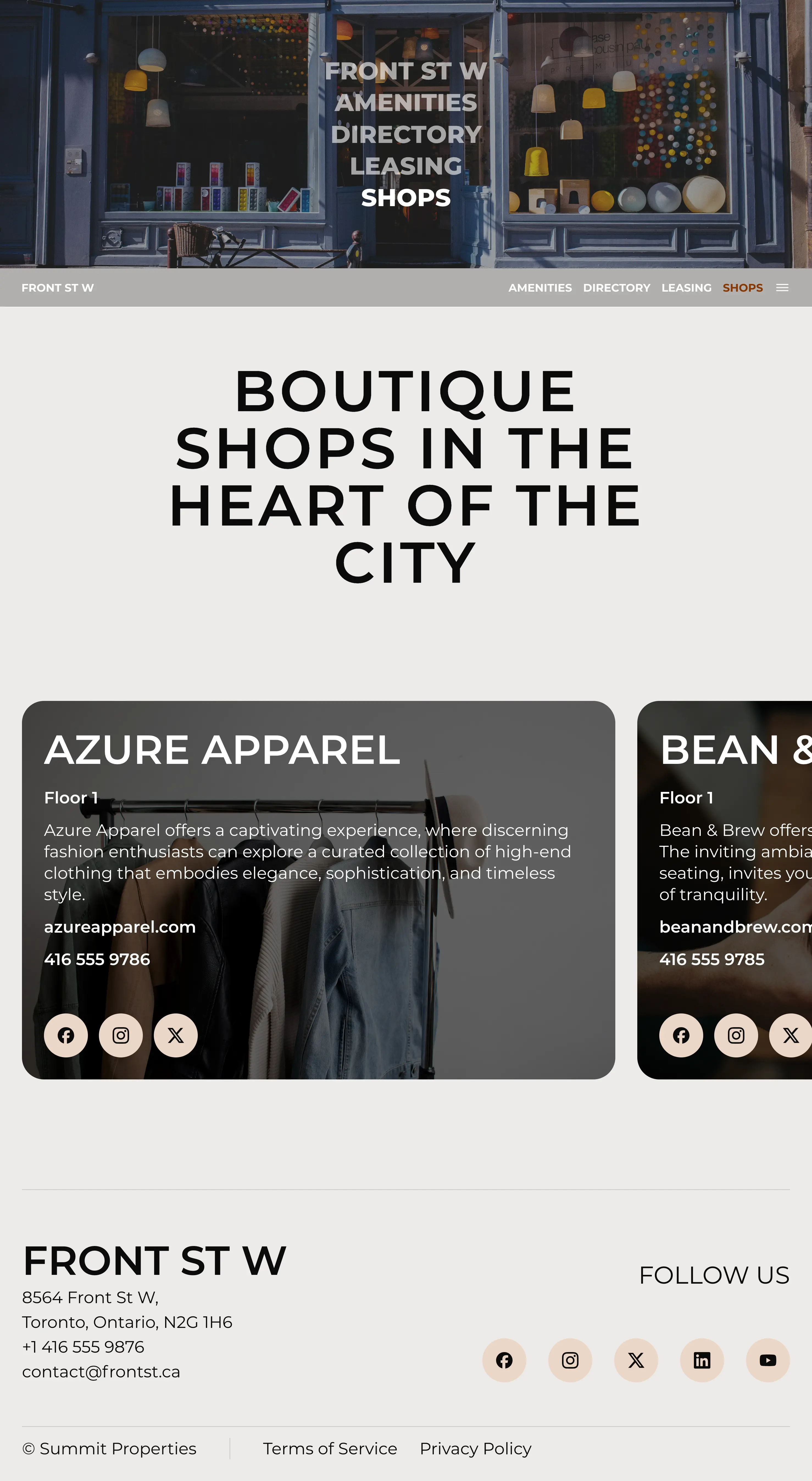
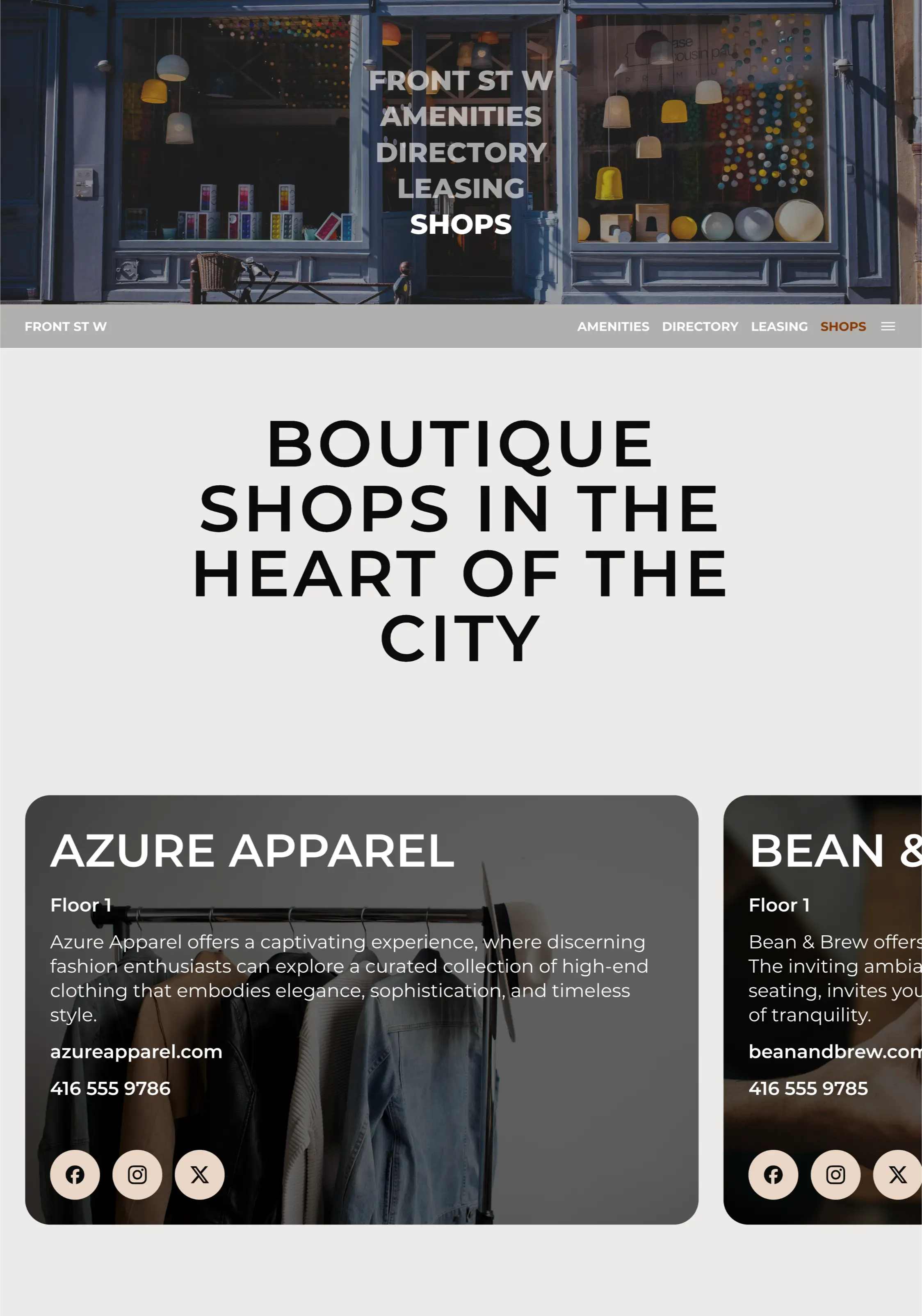
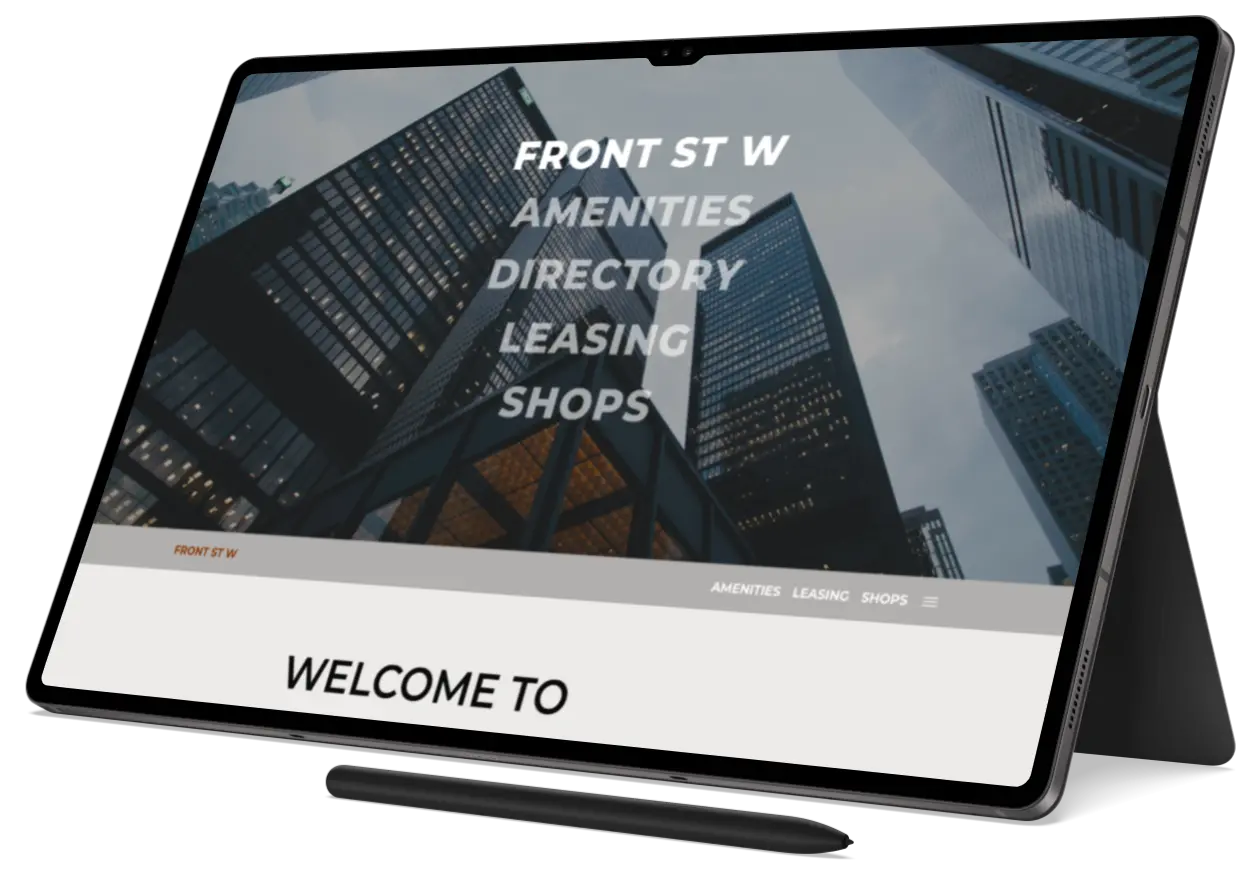
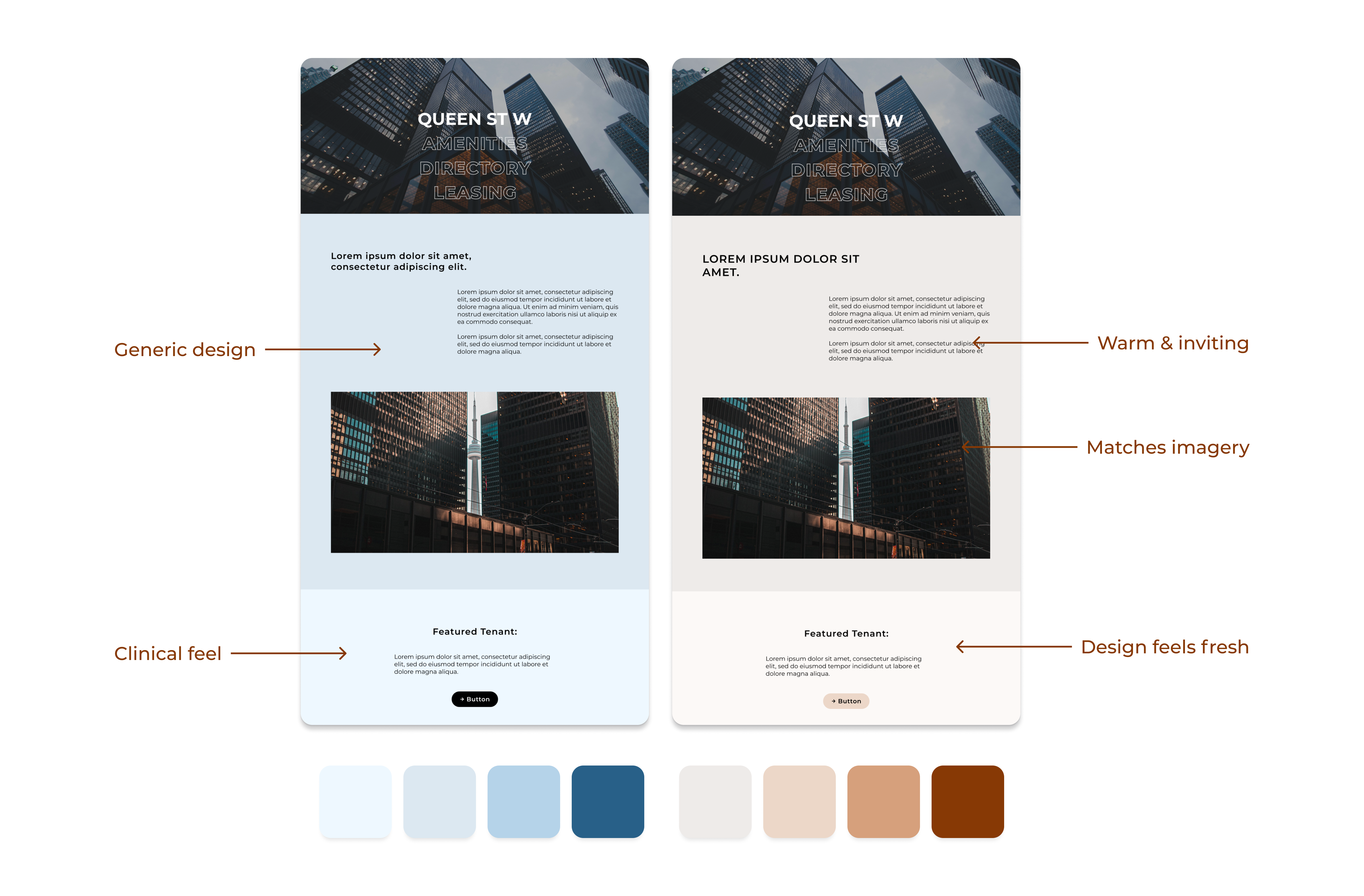
There was a clear trend among the websites which passed the team’s approval for use as inspiration. They stood out by using bold fonts at large sizes, abundant imagery, and a colour palette filled with warm neutrals.
There was an easy balance between beauty and information. The data across each example site was divided among many pages and sections, with only the most important pages competing for header space. All other nav was tucked away neatly behind larger hidden menus.
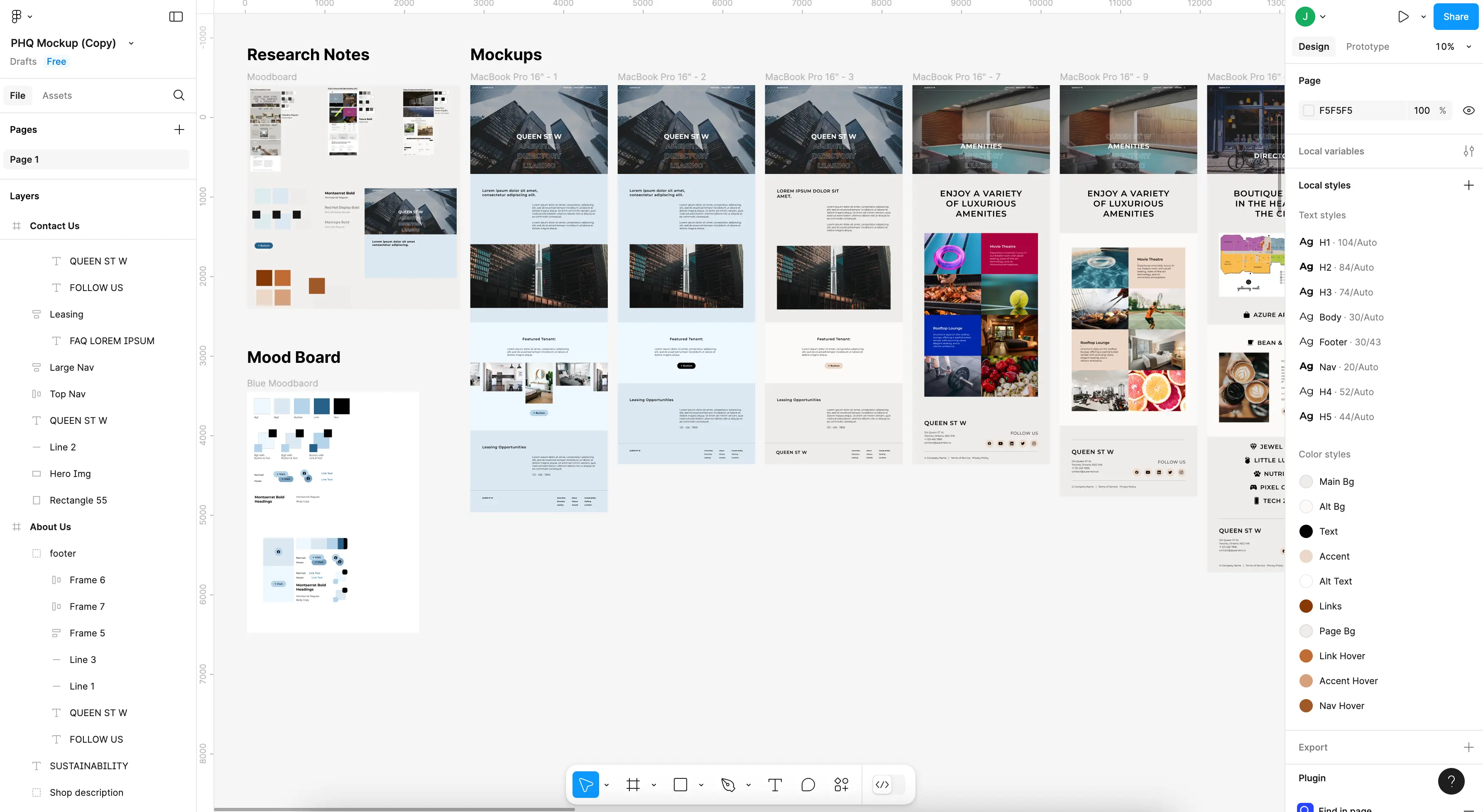
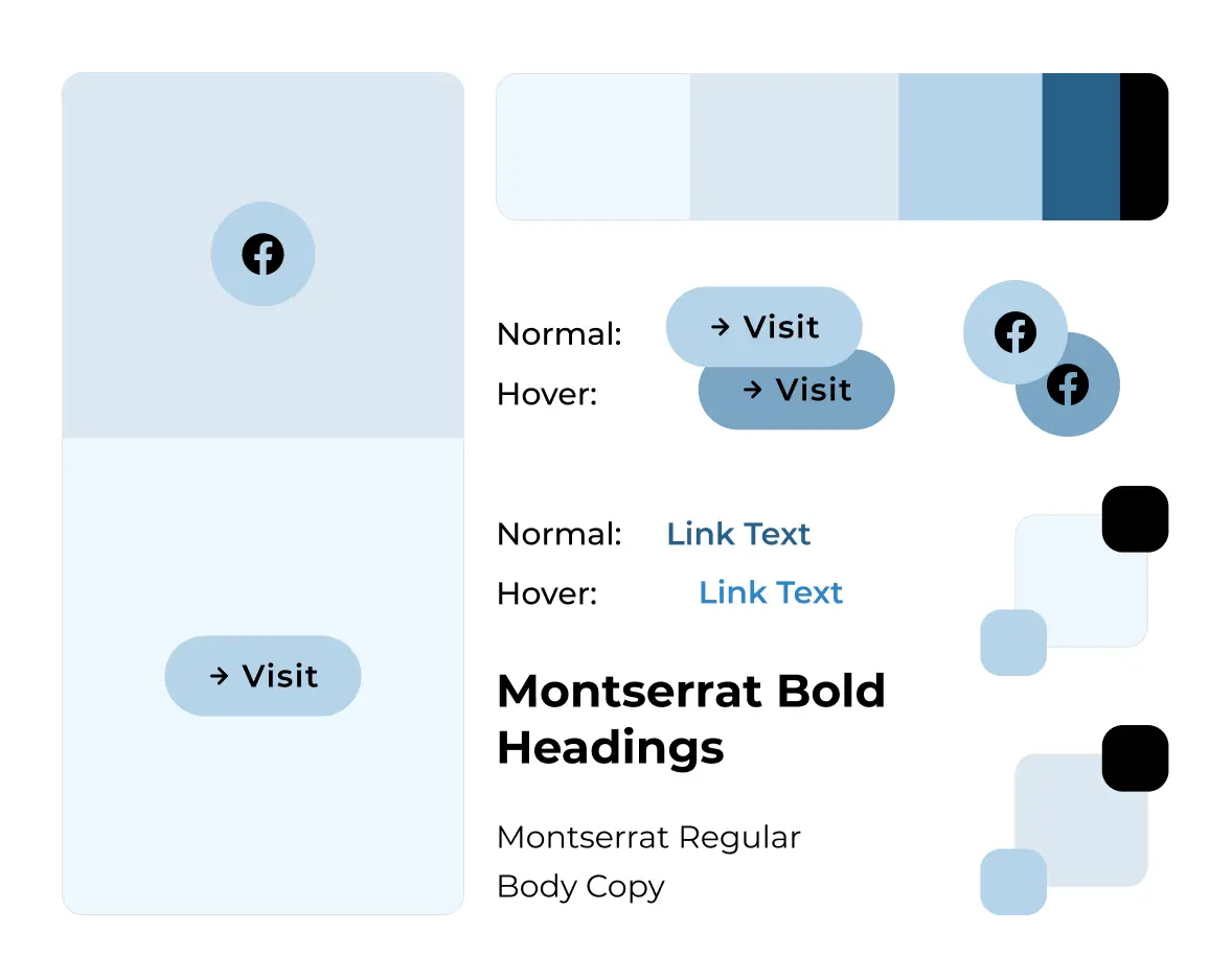
The design process for this project involved a lot of experimentation with fonts and colours to achieve a bold design. My initial mockups had used a cool blue colour scheme, I knew they were missing the mark but struggled to diagnose the issue.
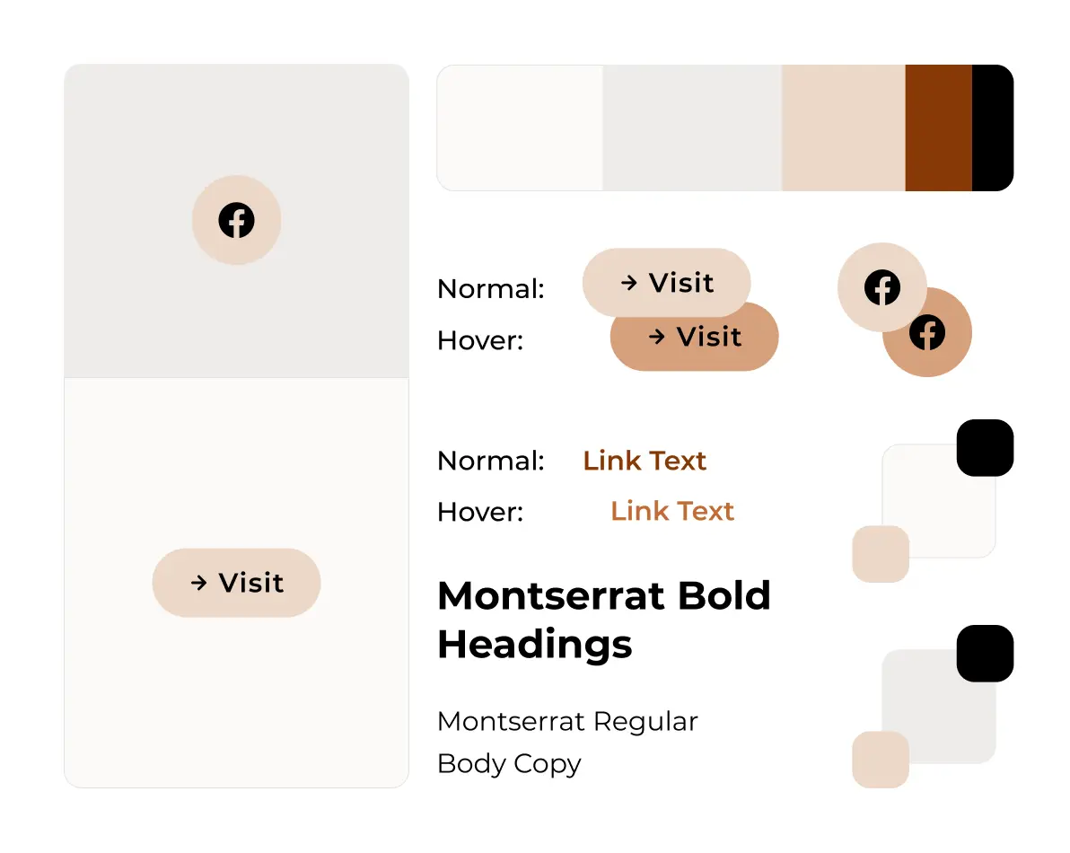
The turning point in the design came when I switched to a palette of warm browns. This small but powerful change helped align the design with the high-end experience we were aiming for. The website instantly felt more polished and inviting.
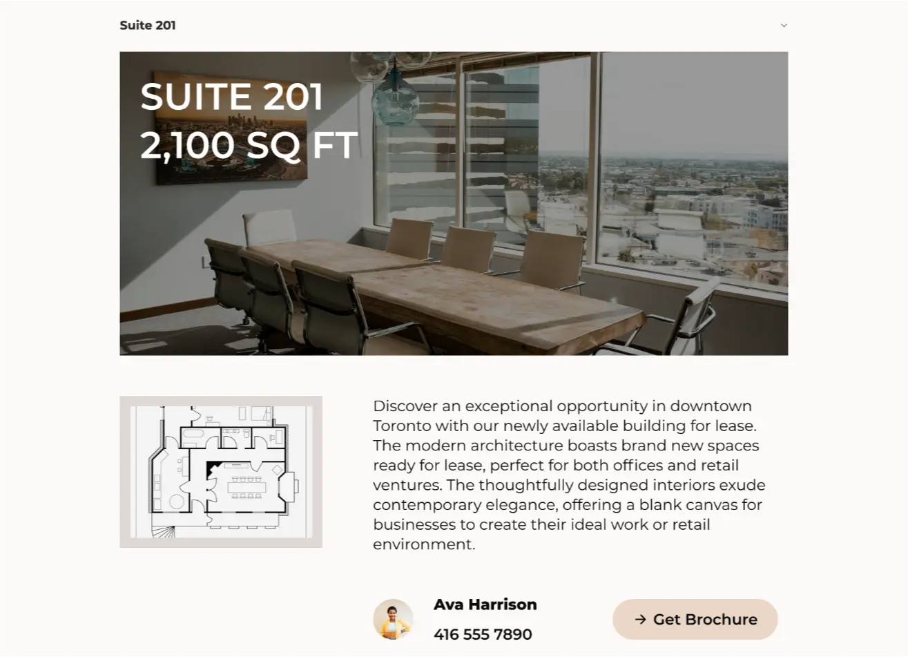
To ensure all of the property data was not only easy to find but easy to manage, we implemented the following:
By creating an updatable CMS, we made certain the website could plug and play any property location by simply filling out an online form to repopulate the content.
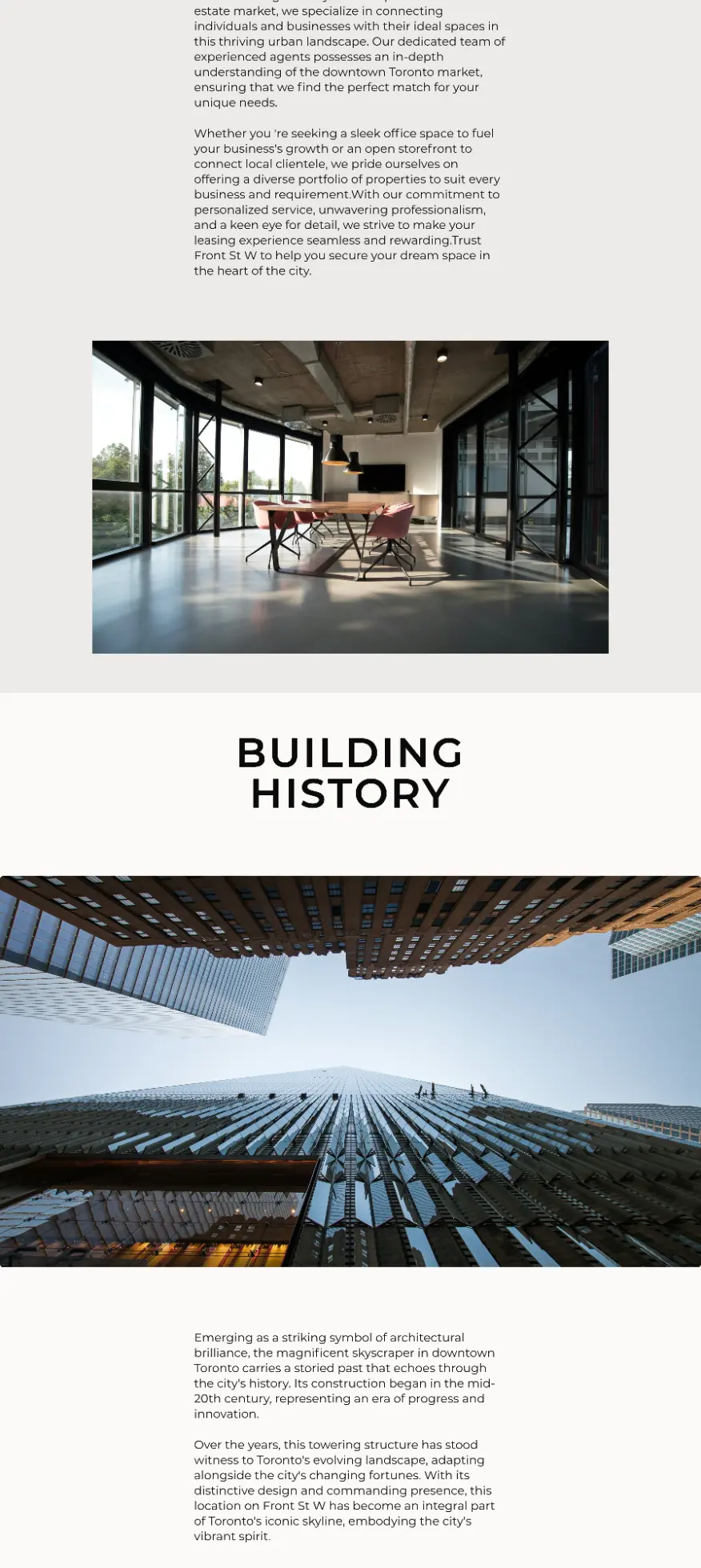
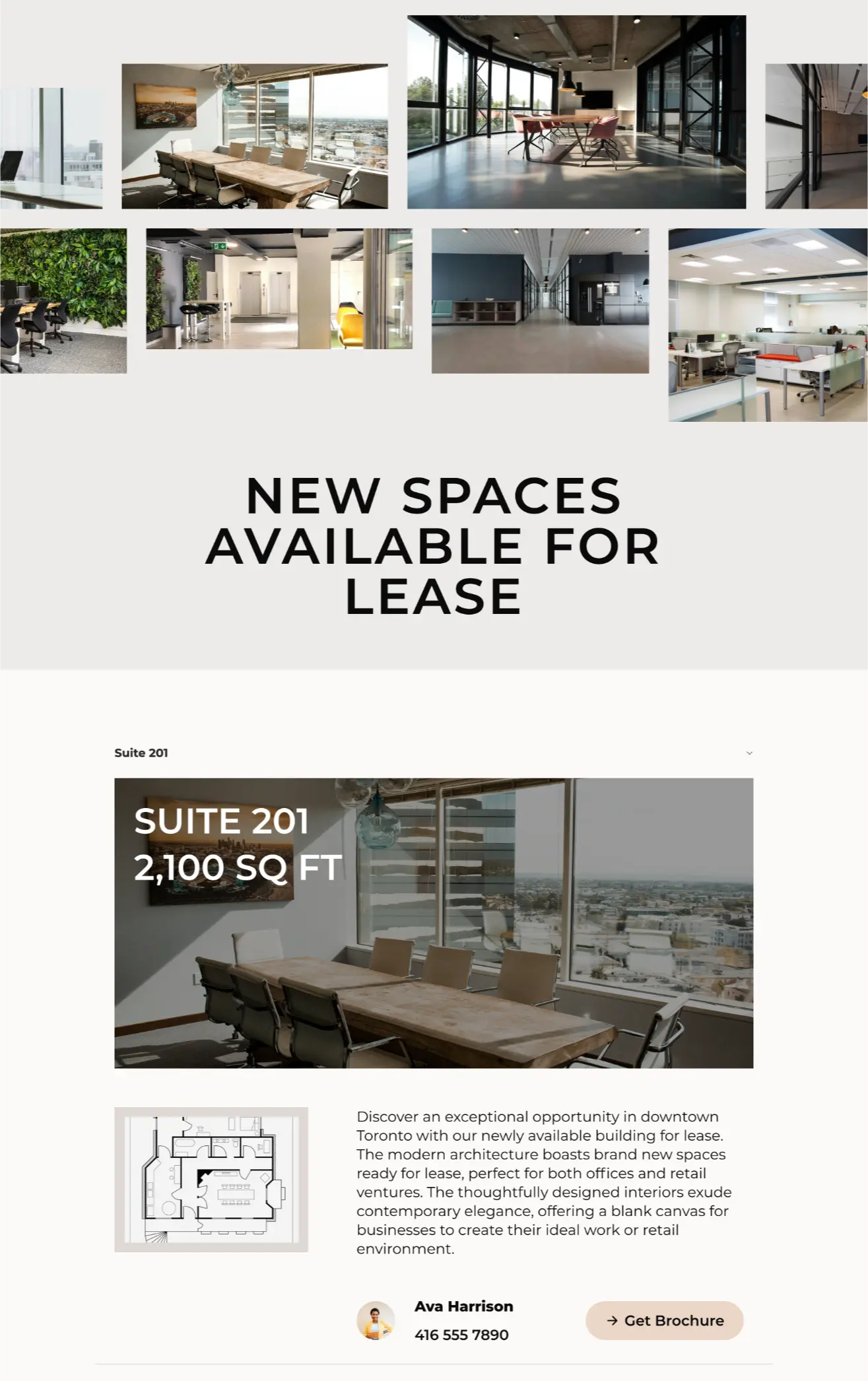
In order to avoid information overload parts of the data were hidden behind accordions and dropdown menus. The information was still clearly available, but not immediately shown.
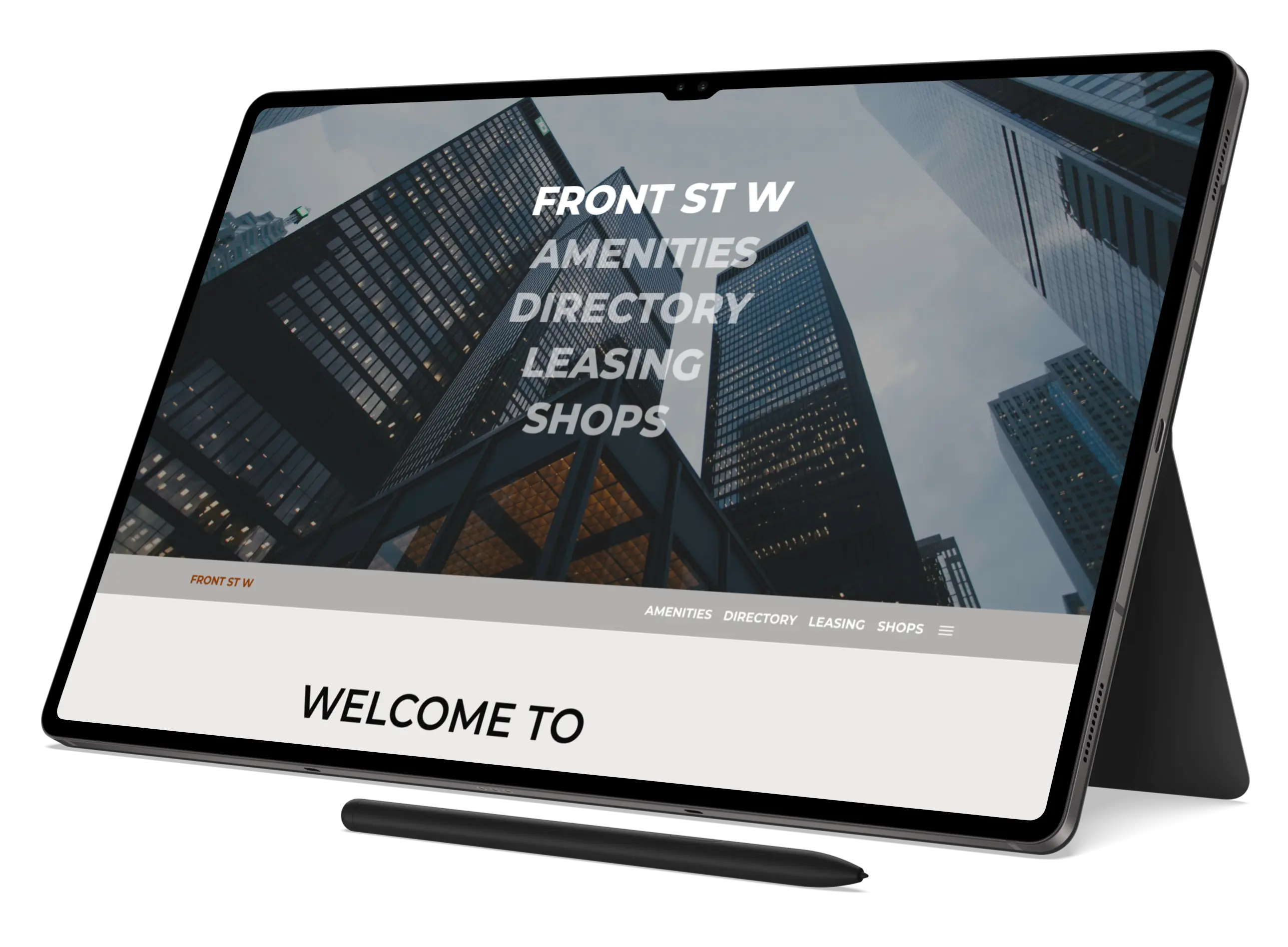
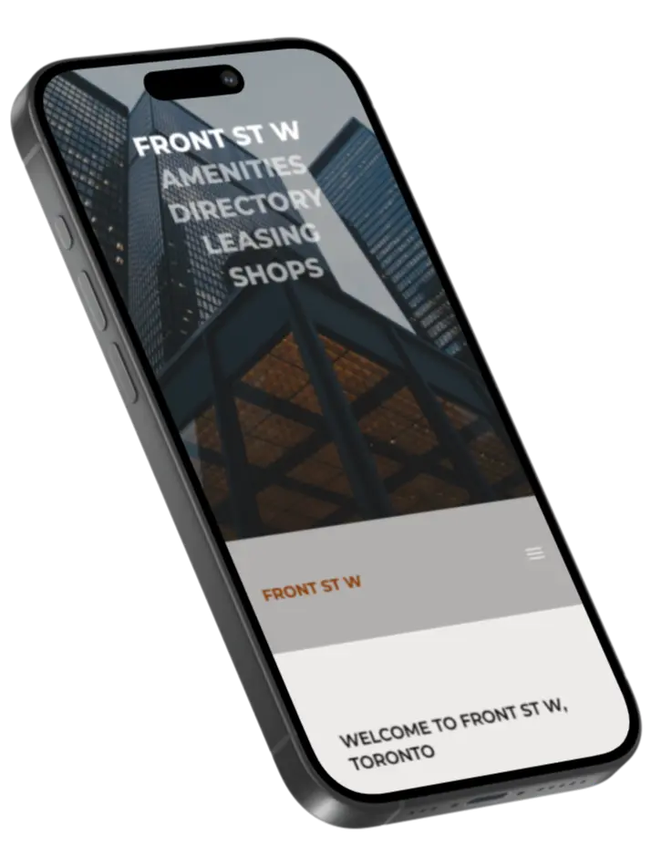
Due to the large size of design elements, individual components were given special attention for mobile screens, e.g., font sizes using clamps, images scrolling off-screen, hamburger menus, etc.