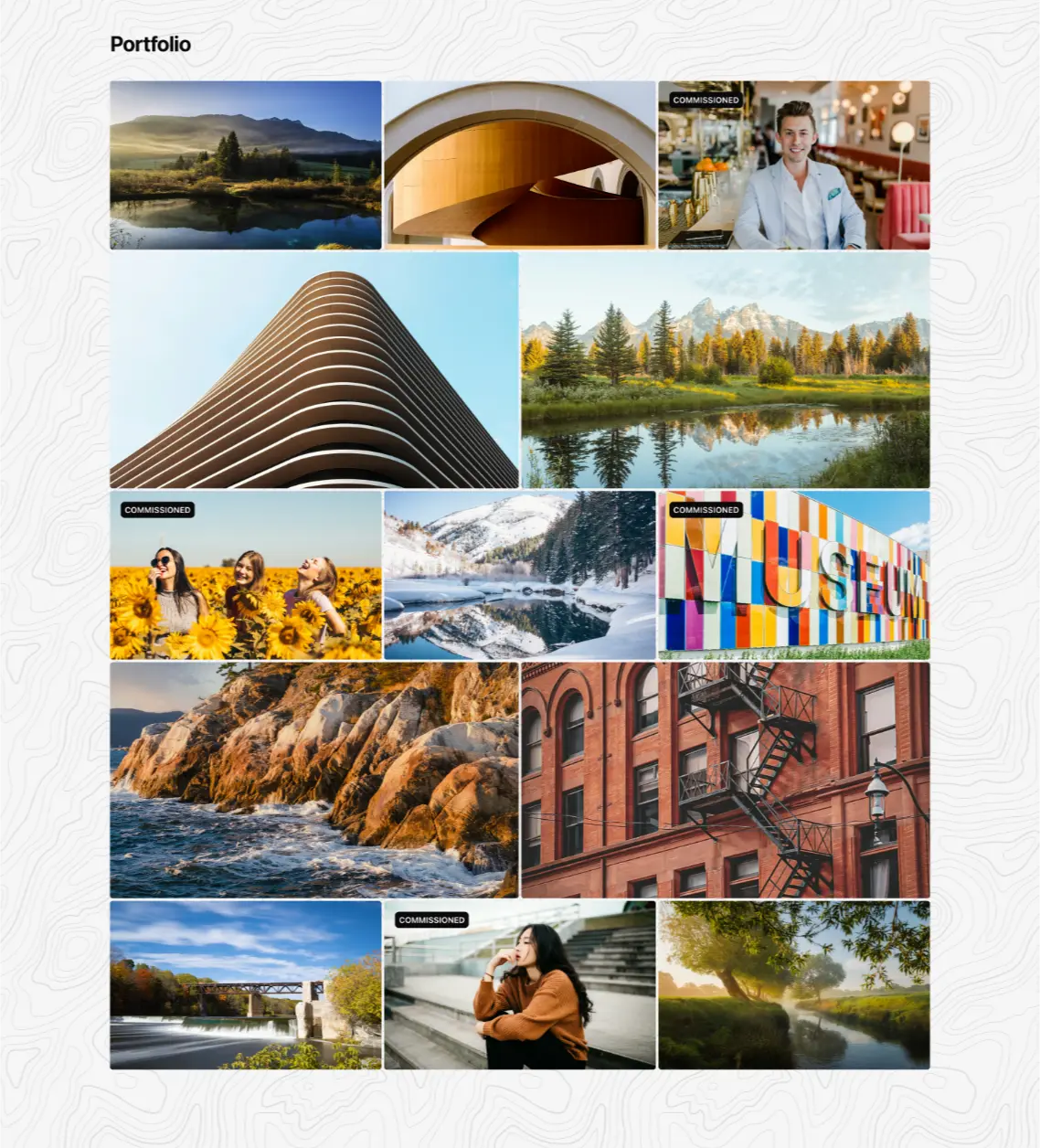
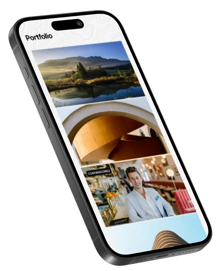
A Patterned Background
A topographical pattern is used as a background element throughout the pages to add visual interest. It breaks up the content, avoiding the monotony of a solid white expanse.
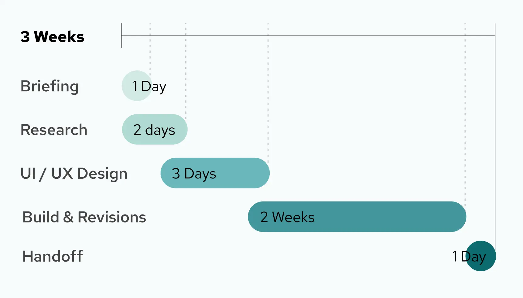
3 minute read
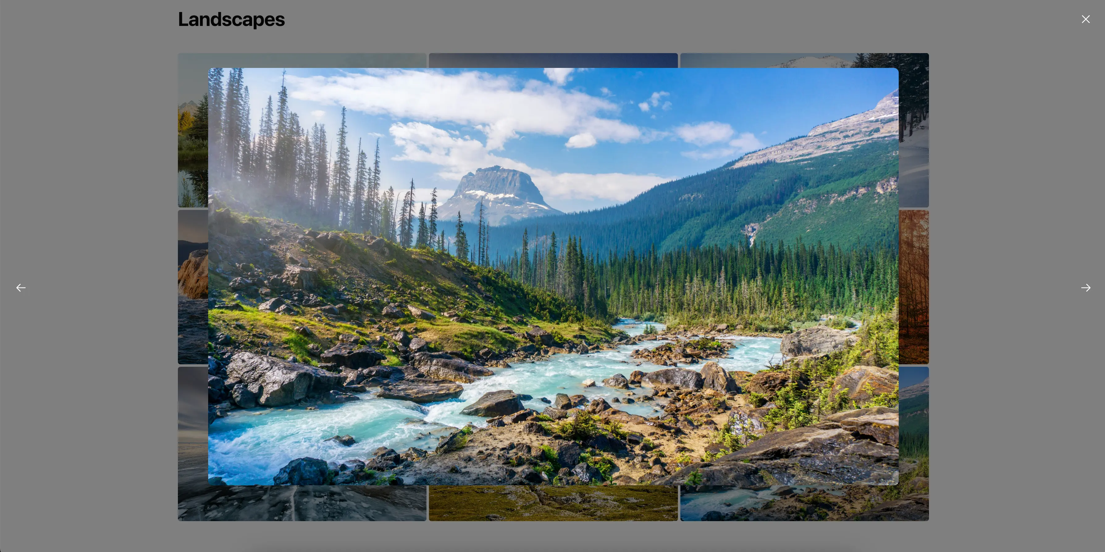
While designing this portfolio template, our biggest challenge was an internal design system overhaul that broke the lightbox image modals with every update. Through many rounds of debugging, I was able to stabilize the modals and deliver a template that elevated the user experience.
Sitrus.ai | 2024
UI/UX | Design | Development
Designer & UX Developer
This work was built with the help of AI to increase the speed of completion and integrate frontend functionality from the Figma design into the completed webpage.
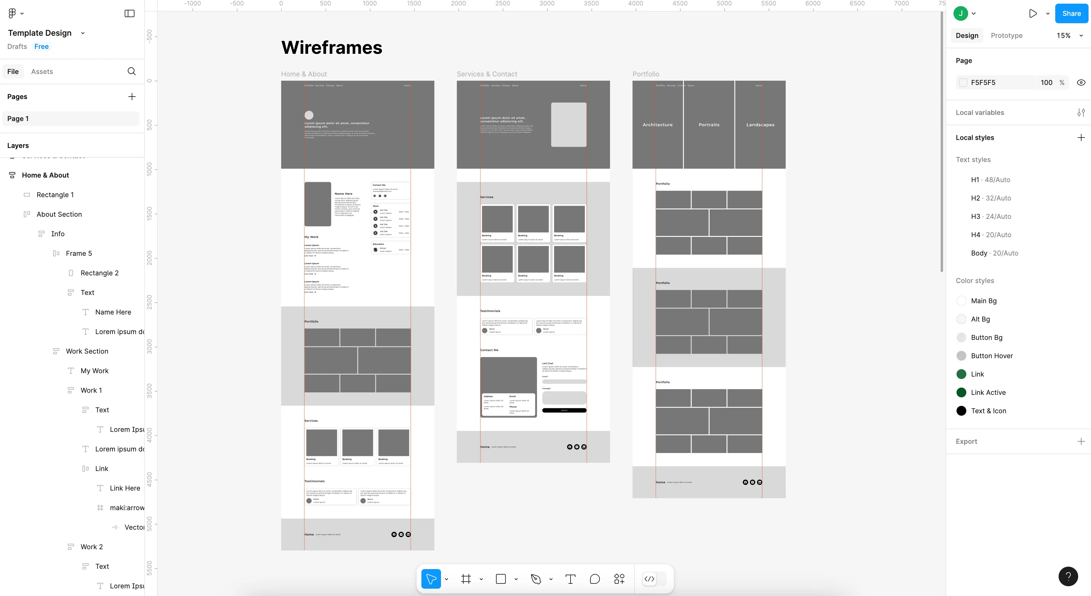
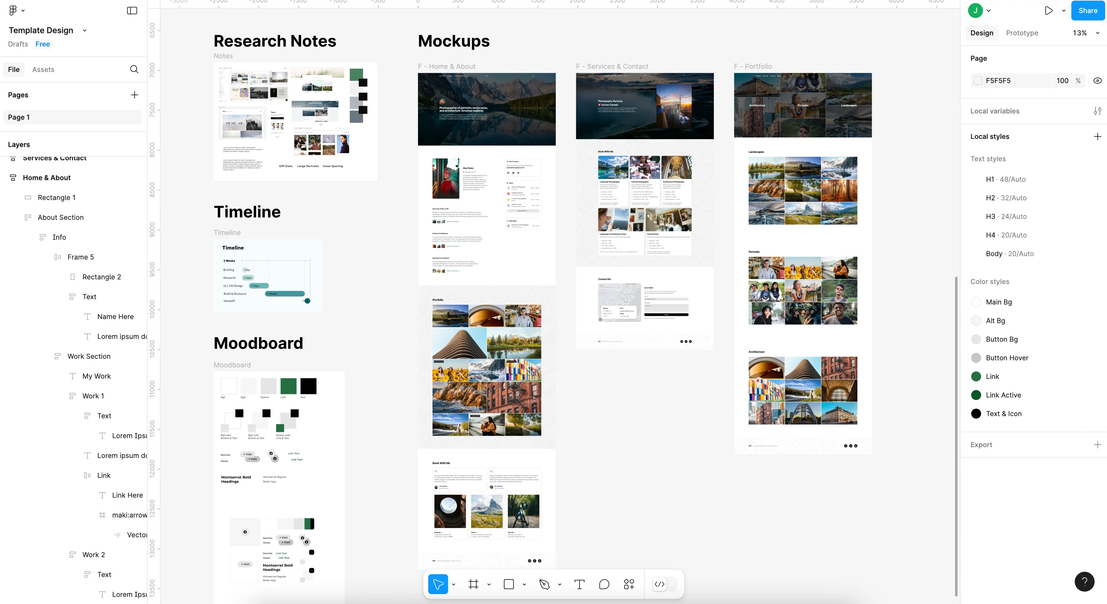
From the outside, the task seemed simple enough: create a sample portfolio template for Sitrus.AI’s library. The goal was to incorporate interactive elements that would differentiate our template from the static, off-the-shelf options widely available from competitors.
To begin, I focused my research on finding unique layouts that could elevate the design and give it a fresh, dynamic feel.
The real challenge - or so I thought at the time - was that this template would be used to train Sitrus’ AI model on web design best practices. That meant all of the code and design needed to be streamlined and error-free.
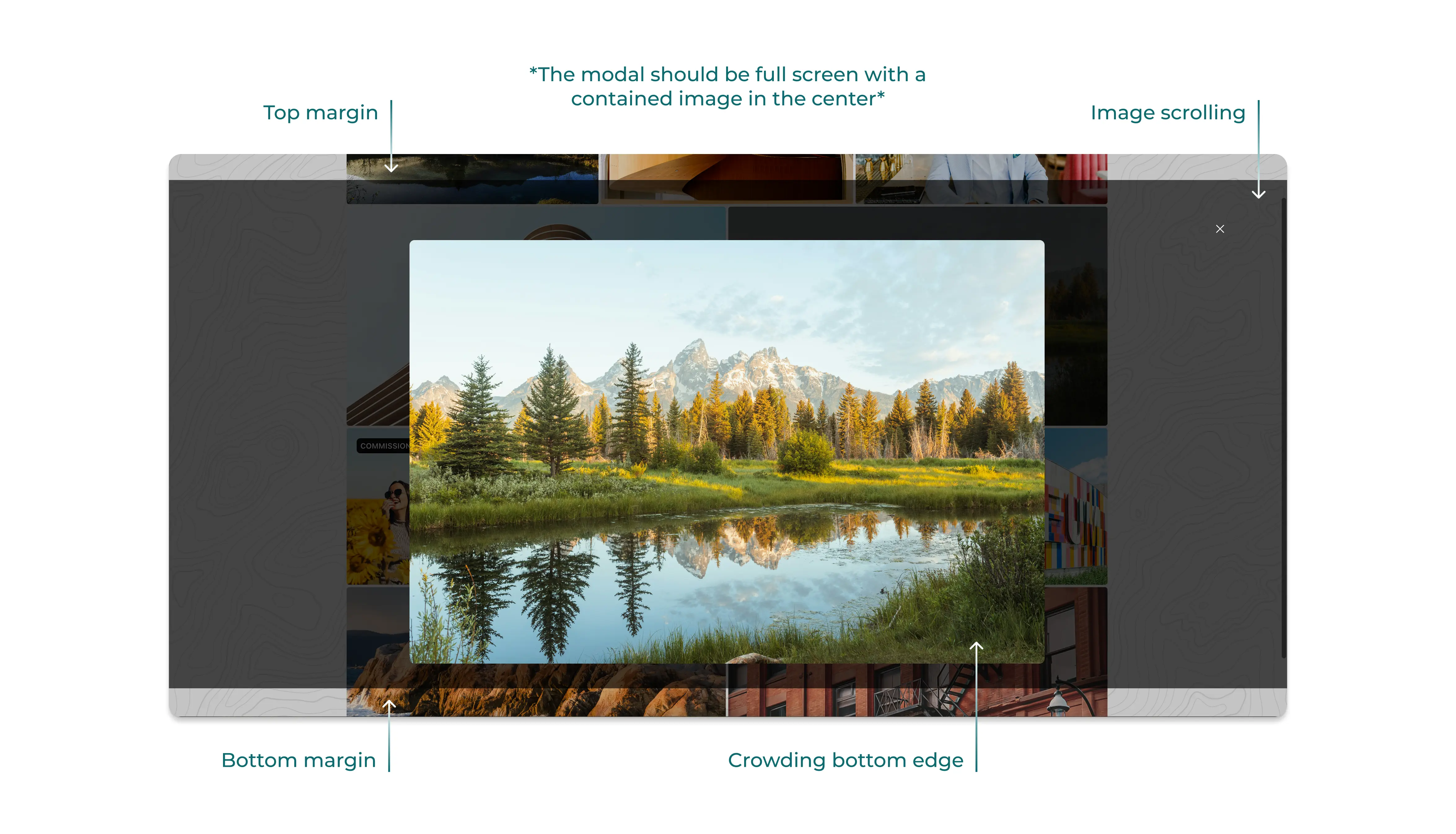
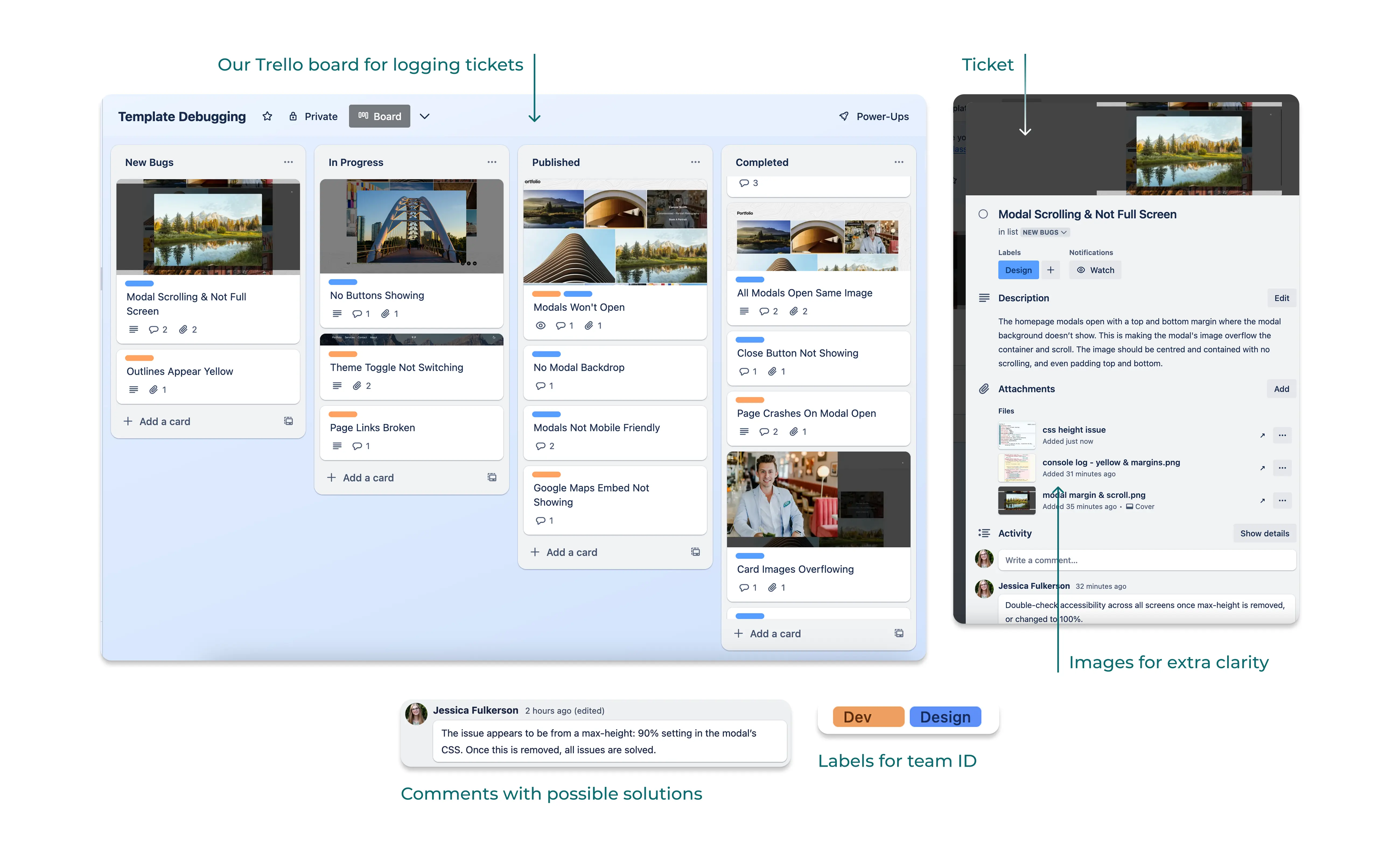
The templates' most distinguishing feature, the lightbox modals, were constantly breaking due to a shifting backend structure. With every update of Sitrus’ backend, the lightbox modals broke in new and increasingly complex ways.
With each update came a unique new bug with an equally singular fix. At a glance, the issue seemed to always be the same: the image modals were breaking, while the rest of the template remained intact. But the underlying cause was continually changing, along with the exact way the modal was breaking.
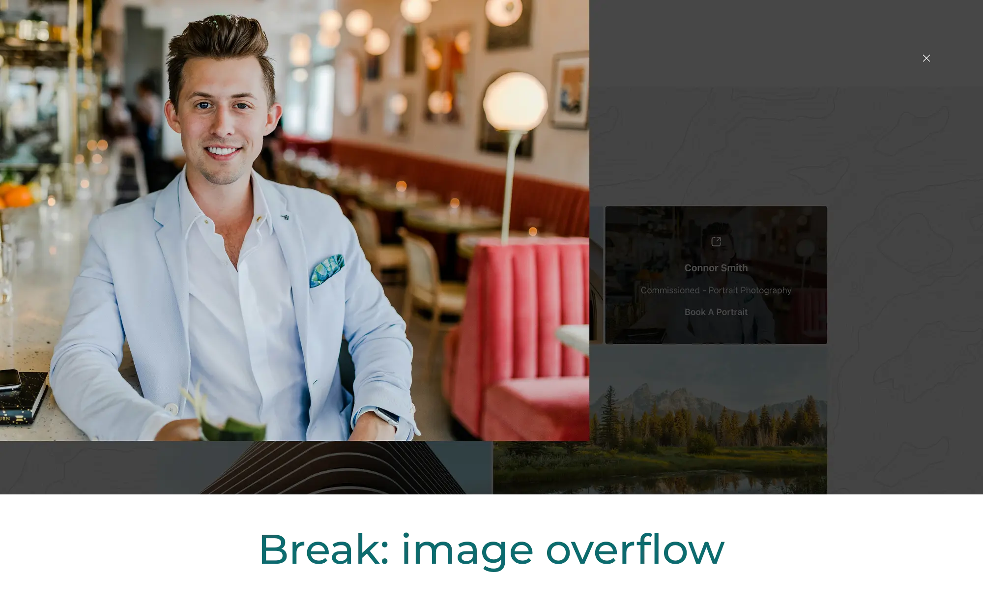
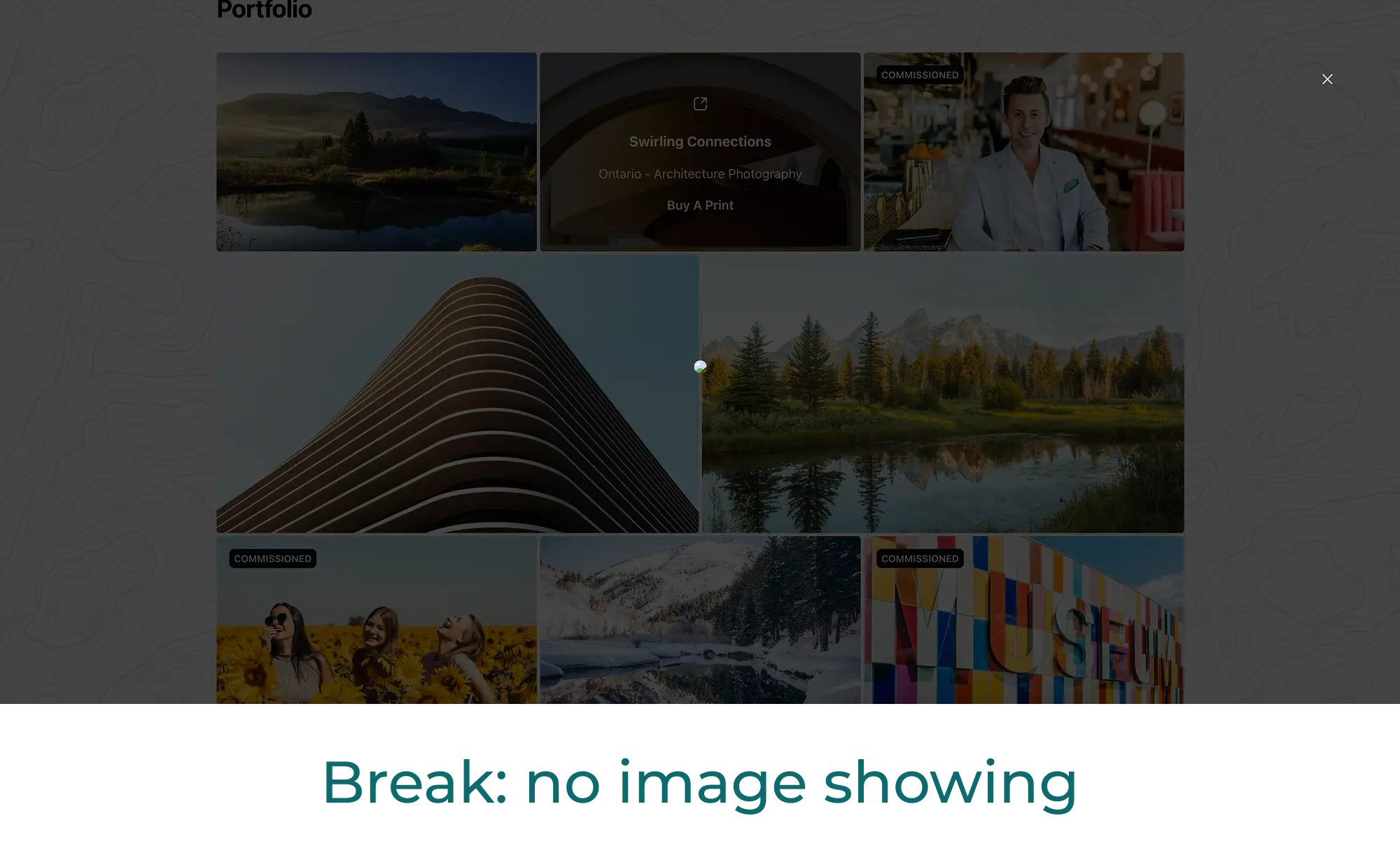
The issues ranged from small flex layout problems of images suddenly overflowing their containers, to fully breaking bugs in which opening a modal crashed the entire website. This bug took the longest to fix and nearly scrapped the project in the process.
With each backend update, I was given a list of incoming changes from the dev team; these would generally point me in the right direction when the modals inevitably broke.
Upon finding a new issue, I would open the browser's inspector and go through the code and console logs with a fine-tooth comb. Using this method, I was able to diagnose and solve many of the problems alone.
But in a few instances, the bug stemmed from somewhere deeper in the design system. So I’d log a ticket with the dev team, and through a little teamwork, a solution was always found.
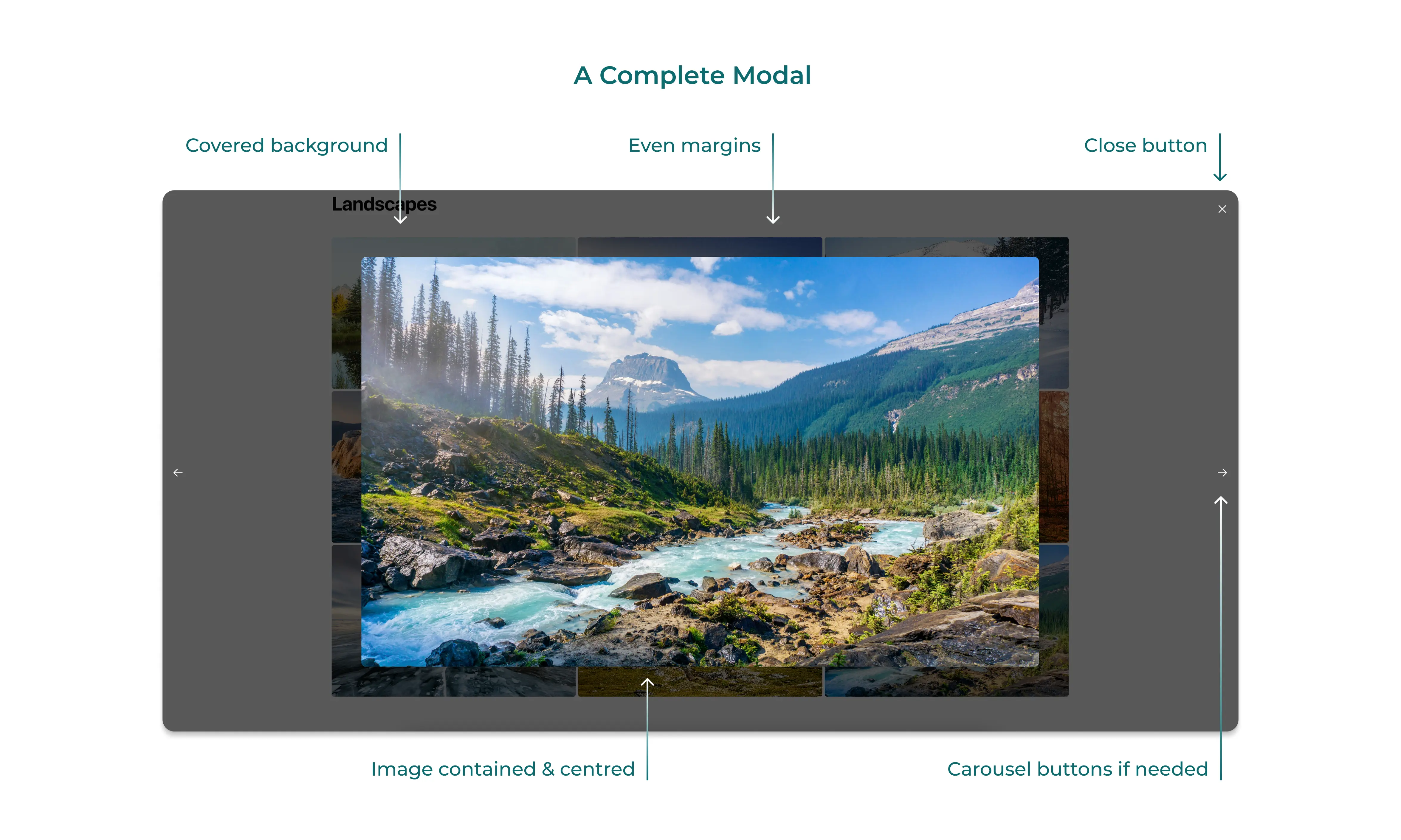
After many rounds of debugging déjà vu, the resulting portfolio template offered a frictionless user experience, with a fresh, interactive design featuring three standout elements:
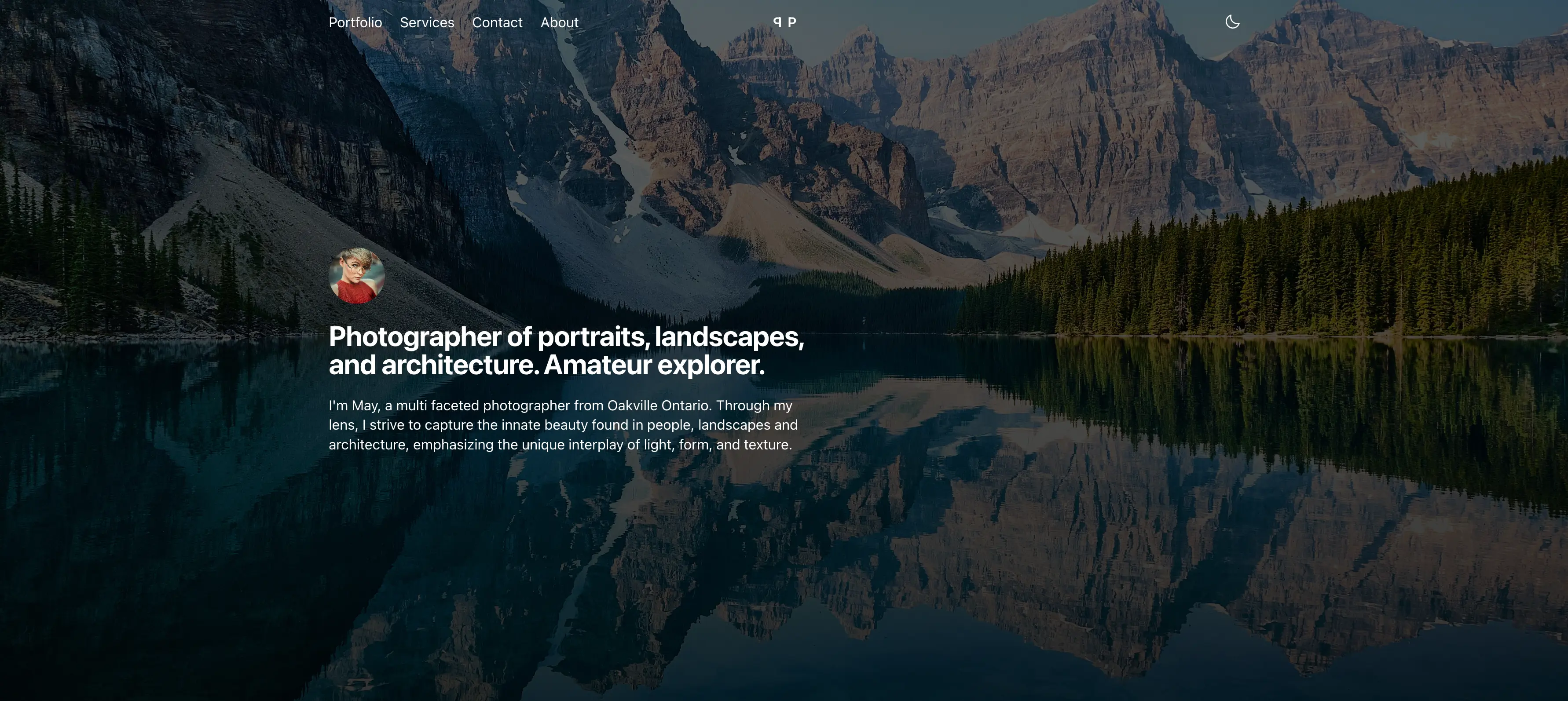
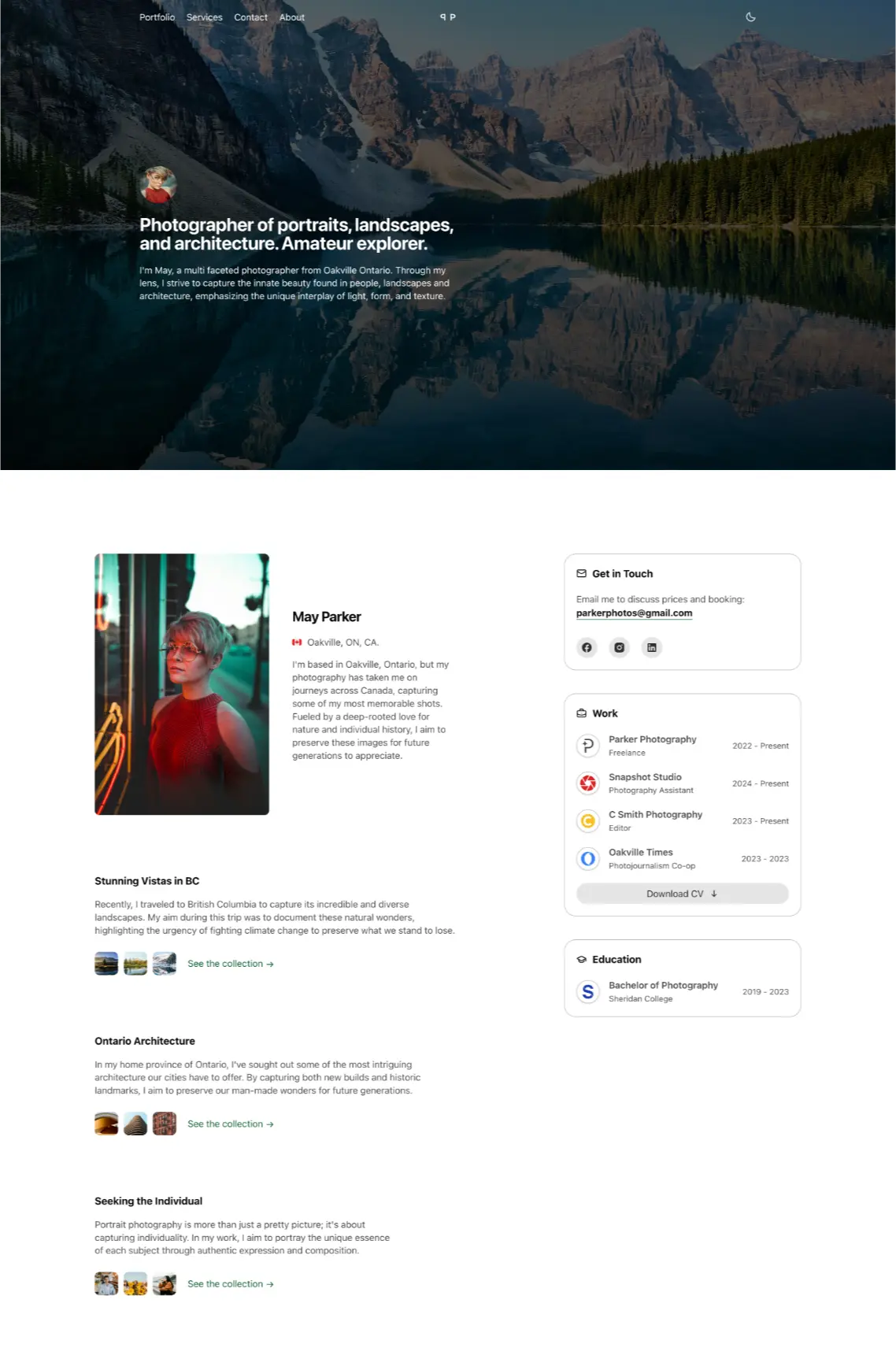
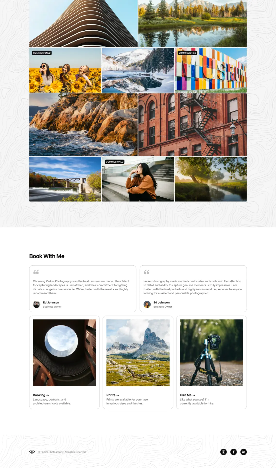
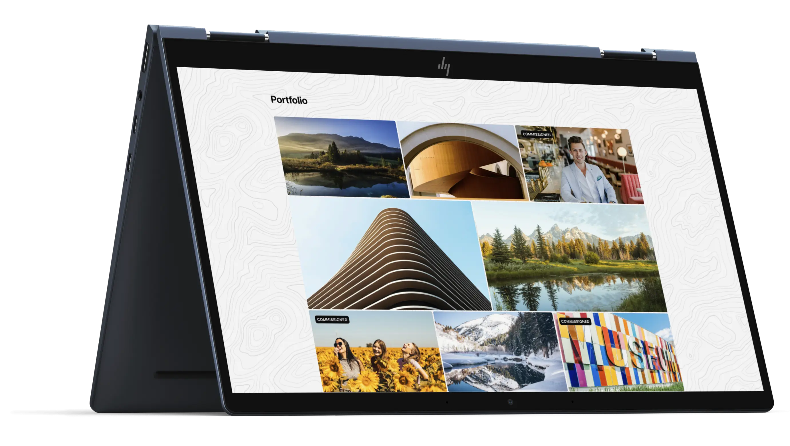
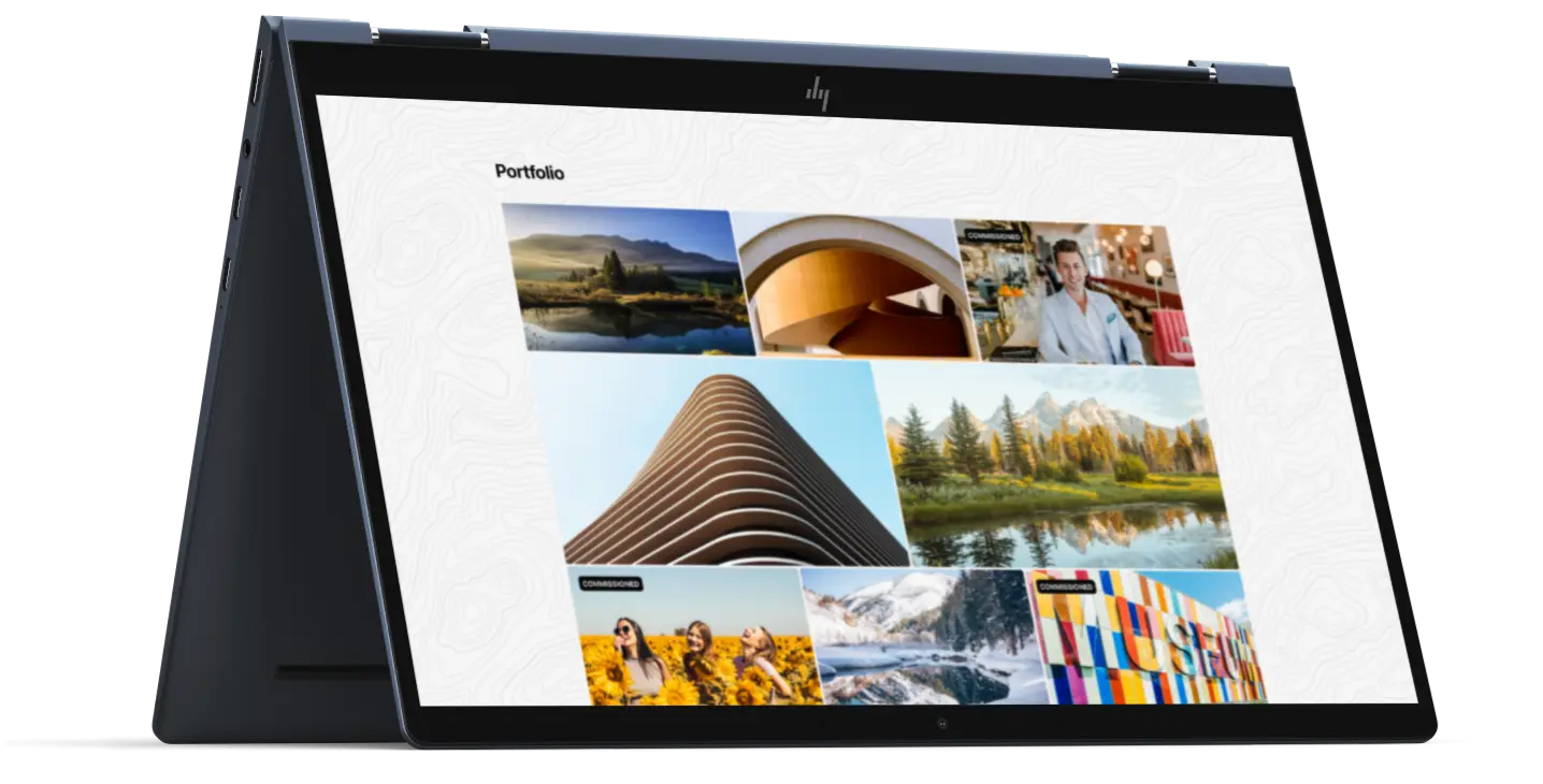
A topographical pattern is used as a background element throughout the pages to add visual interest. It breaks up the content, avoiding the monotony of a solid white expanse.
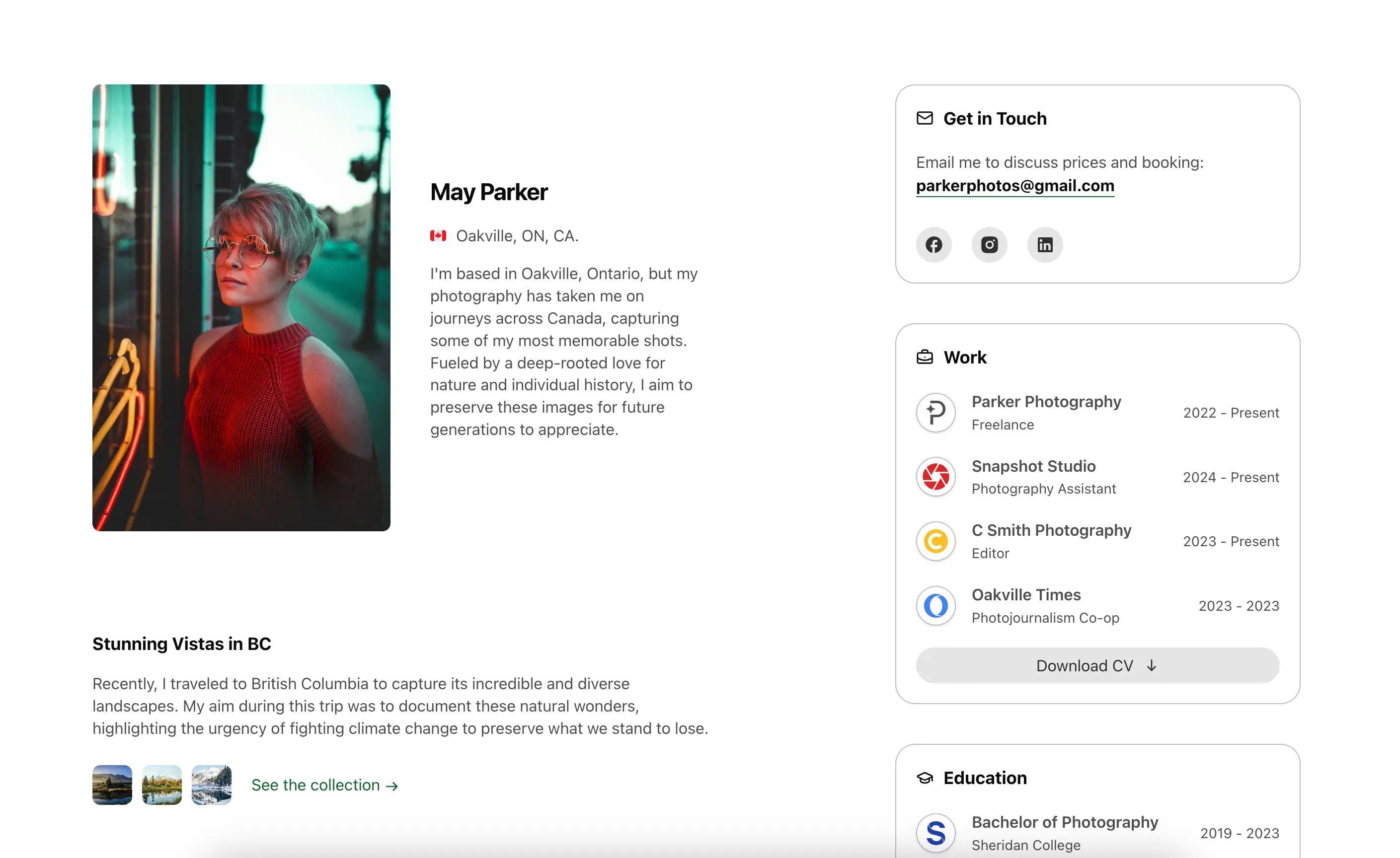
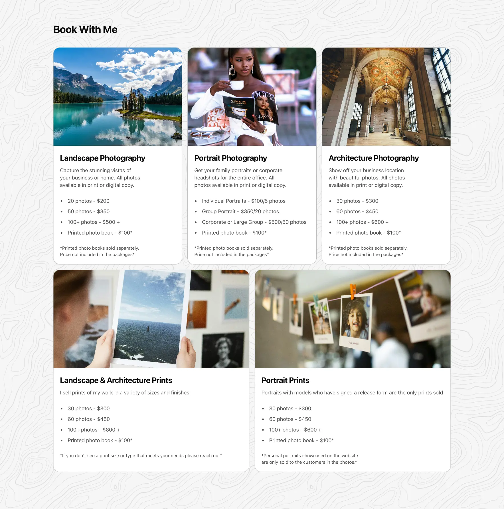
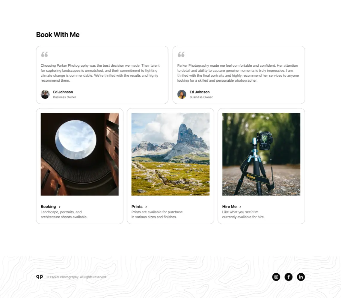
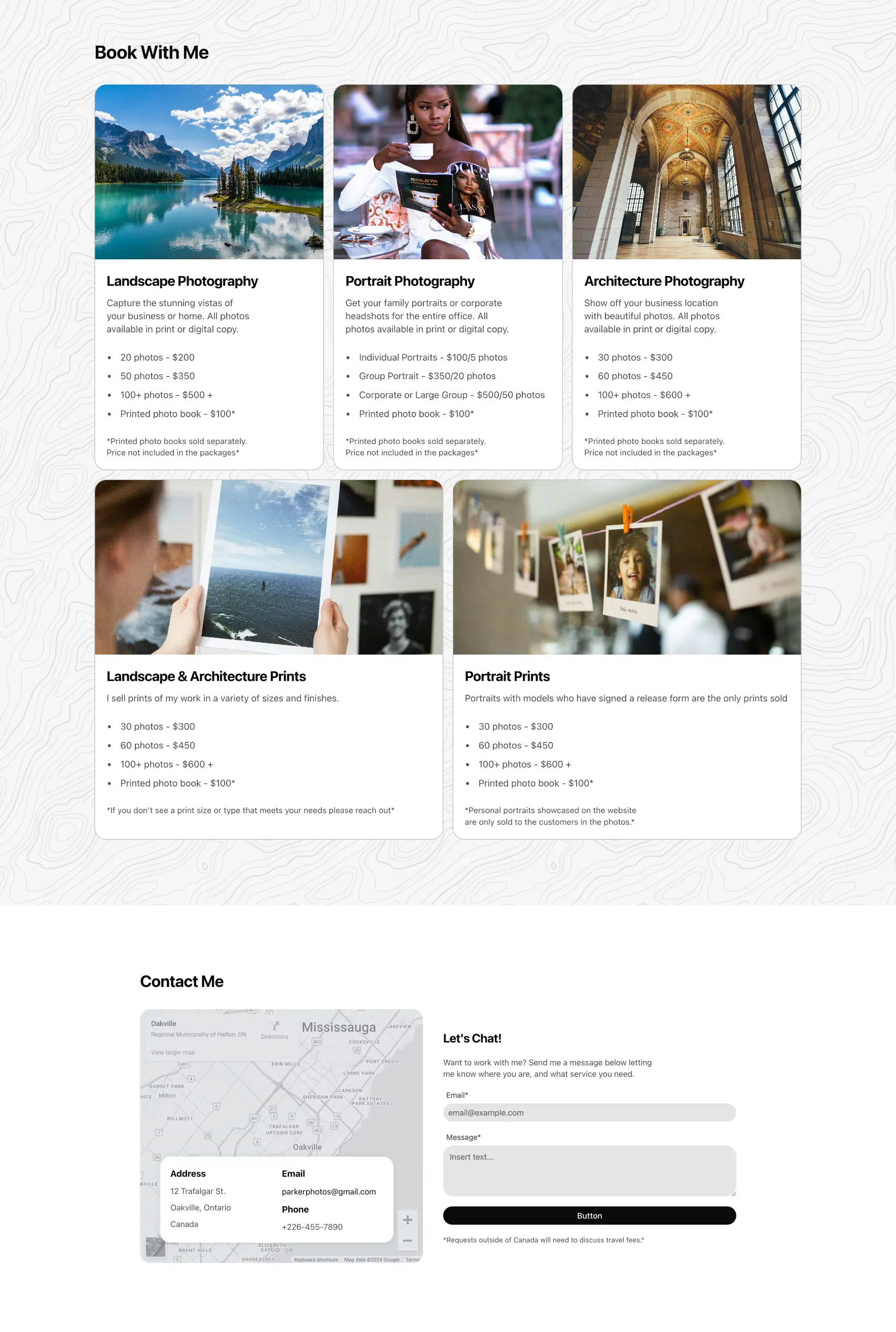
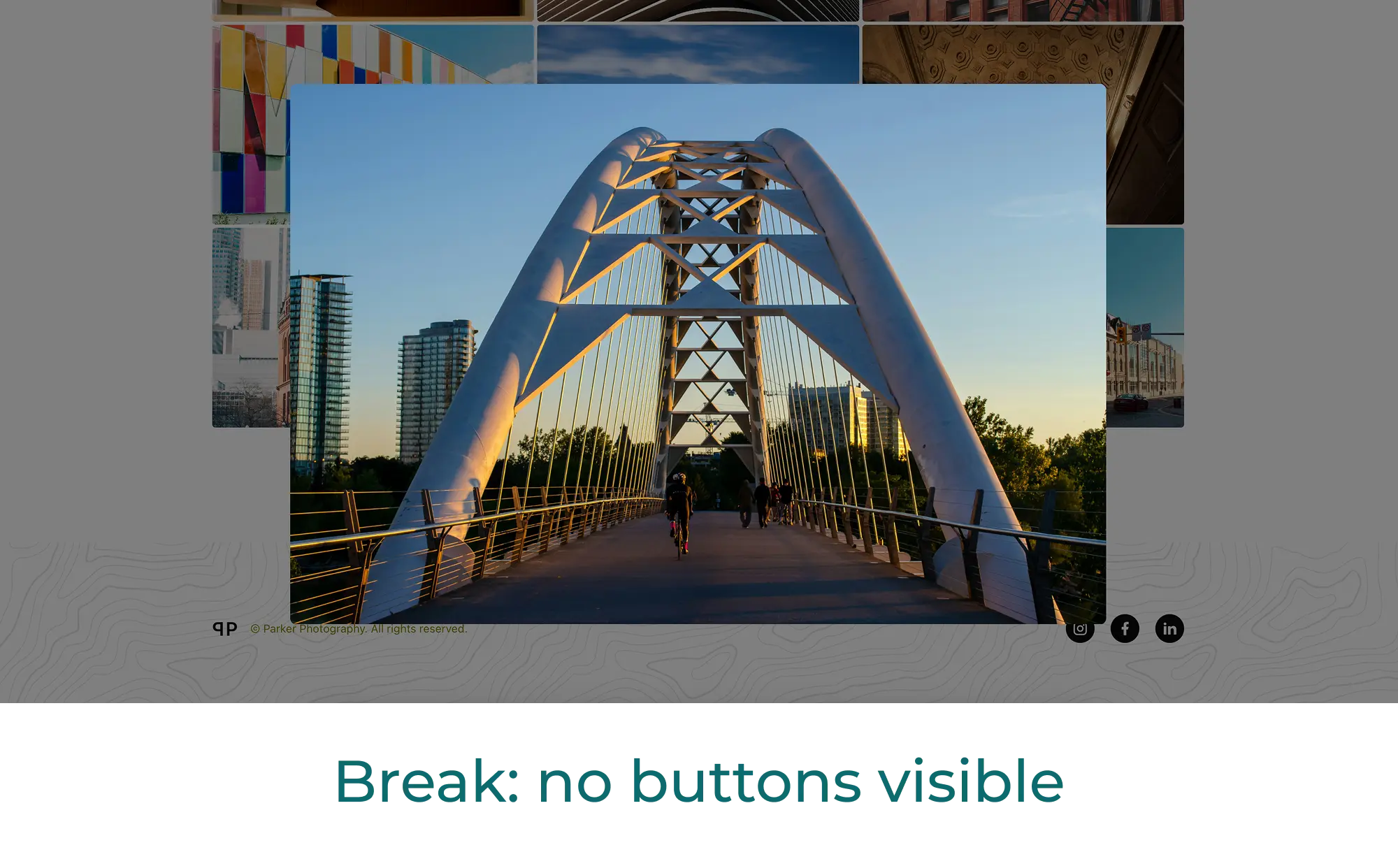
Images on both the homepage and the portfolio galleries can be viewed in full-screen lightbox modals. The portfolio modals feature a carousel function for added usability.
The theme toggle in the navbar (provided by the dev team) allows users to swap the site from a light to a dark theme. The design elements were carefully balanced to guarantee accessibility in both themes.